VISPER
project goal, process, and outcome
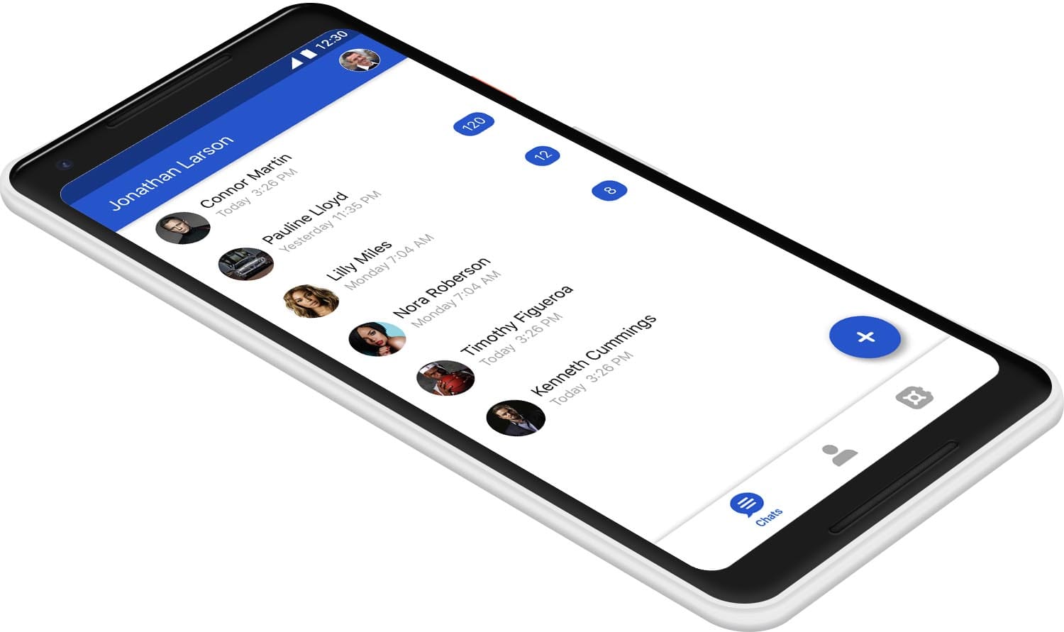
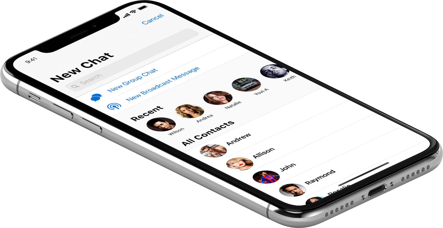
VISPER is a secure chat application for iOS and Android. In this case study I will go over the steps I took from information gathering, to high fidelity design, and developer hand off.
One of the biggest challenges of designing a chat application, is to get out of the way of the user who simply wants to connect with friends and family. The tendency to add moments of delight in communication apps should be avoided if they are not experienced by everybody in the chat. After all, the real delight is connecting with others.
Information Gathering
My first goal was to learn as much as possible about the project so that I can move quickly and make the right decisions that align with the company goals while designing the app.
I had a couple of meetings with stakeholders to try and understand as much as possible about the problem that we are trying to solve. I find it really helpful to play the devil's advocate and challenge both the problem and the solution at this stage so that all stakeholders come to the same understanding of what it is that we're trying to do.
Having a solid understanding of the problem we're trying to solve and how our solution differs from others on the market helps with most design decisions. If you're stuck between two design solution, simply check which one solves the problem more efficiently and better highlights the differentiating factor. This helps the company save a lot of time, move faster, and get to market quicker.
Information Architecture
My next goal was to get all of the stakeholders on the same page about what features are there going to be in the app.
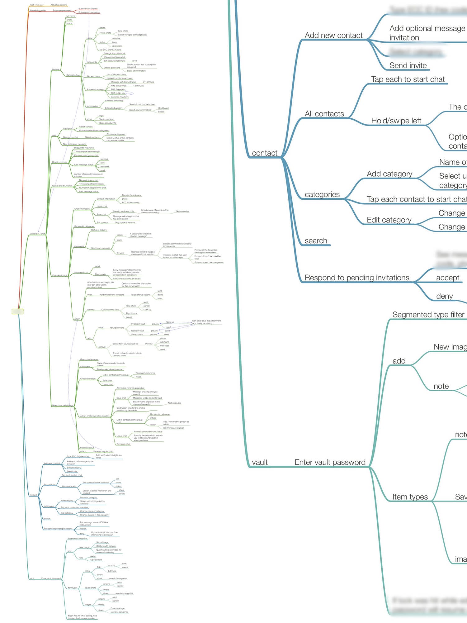
I started working on a mind-map (shown below) that includes all of the pages and features that I thought should be in the app. Mind-maps at this stage are invaluable to move the project forward as fast as possible. After creating a first draft, I help a meeting with all stakeholders and walked them through all of the pages. There are two benefits of using the mind-map that become very clear at this stage. First, they help being everyone on the same page at a very early stage and they help set expectations for what the final product is going to include. If there are any inconsistencies with their expectations and what is presented here, it's best to address them at this stage when no design or development has taken place. Adding or removing features later in the process would be very costly as they would need a lot of extra time to be re-designed and re-developed. Second benefit of the mind-map is how quickly it can be iterated upon. If some features needed to be moved to a different page, or if some pages belonged to a different section of the app altogether, it would take only one second to do a drag and drop to fix it.
I started working on a mind-map (shown below) that includes all of the pages and features that I thought should be in the app. Mind-maps at this stage are invaluable to move the project forward as fast as possible. After creating a first draft, I help a meeting with all stakeholders and walked them through all of the pages. There are two benefits of using the mind-map that become very clear at this stage. First, they help being everyone on the same page at a very early stage and they help set expectations for what the final product is going to include. If there are any inconsistencies with their expectations and what is presented here, it's best to address them at this stage when no design or development has taken place. Adding or removing features later in the process would be very costly as they would need a lot of extra time to be re-designed and re-developed. Second benefit of the mind-map is how quickly it can be iterated upon. If some features needed to be moved to a different page, or if some pages belonged to a different section of the app altogether, it would take only one second to do a drag and drop to fix it.
Getting Developers Up To Speed
My next goal was to find if there are any blockers for developers that we needed to be aware of.
I held a meeting with the development team and walked them through every page and feature of the app using the help of the mind-map. I was looking for any areas that they might thing might become a problem in the future. We evaluated any problems that were raised, to see if the problem could be solved with design, front-end development or back-end development. This helped everyone anticipate the tough areas and to prepare better for them in the future.
I held a meeting with the development team and walked them through every page and feature of the app using the help of the mind-map. I was looking for any areas that they might thing might become a problem in the future. We evaluated any problems that were raised, to see if the problem could be solved with design, front-end development or back-end development. This helped everyone anticipate the tough areas and to prepare better for them in the future.
Mind-map to Process Flows
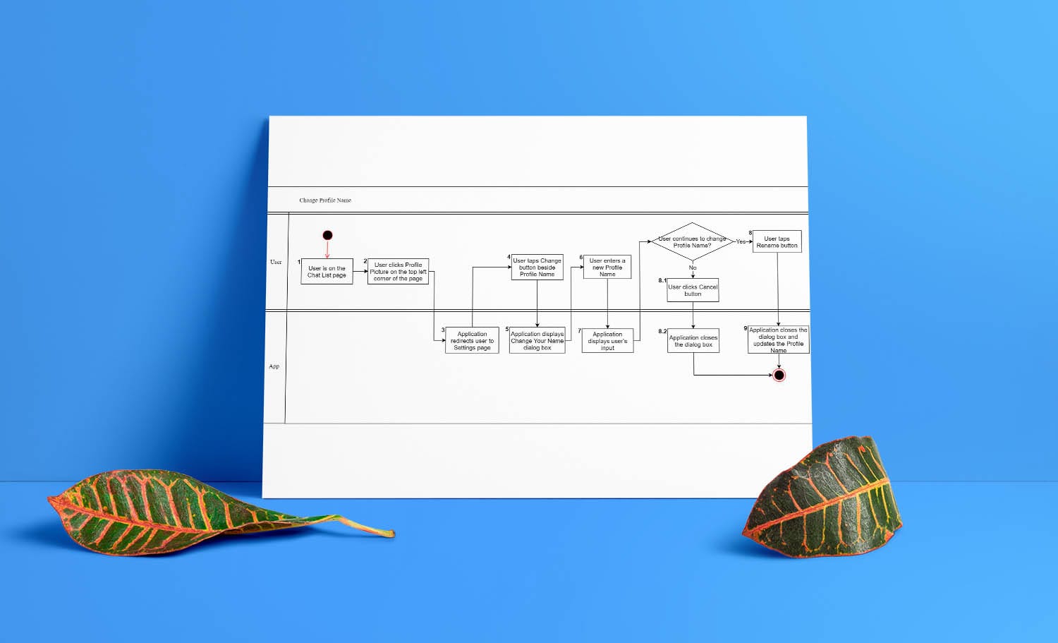
I worked closely with the BA (business analyst) team to create all of process flows. Making sure that all of the states of the app were accounted for.
The mind-map was very helpful at this stage ensuring that we left no stone unturned and all the features were accounted for int he process flows.
The mind-map was very helpful at this stage ensuring that we left no stone unturned and all the features were accounted for int he process flows.
Process Flows to Wireframes
With process flows completed, i used Sketch to quickly create wireframes of all screens. Once the wireframes were approved I made them interactive. For this specific project we used Invision's platform with their CRAFT plug-in for Sketch to create the interactive prototype.
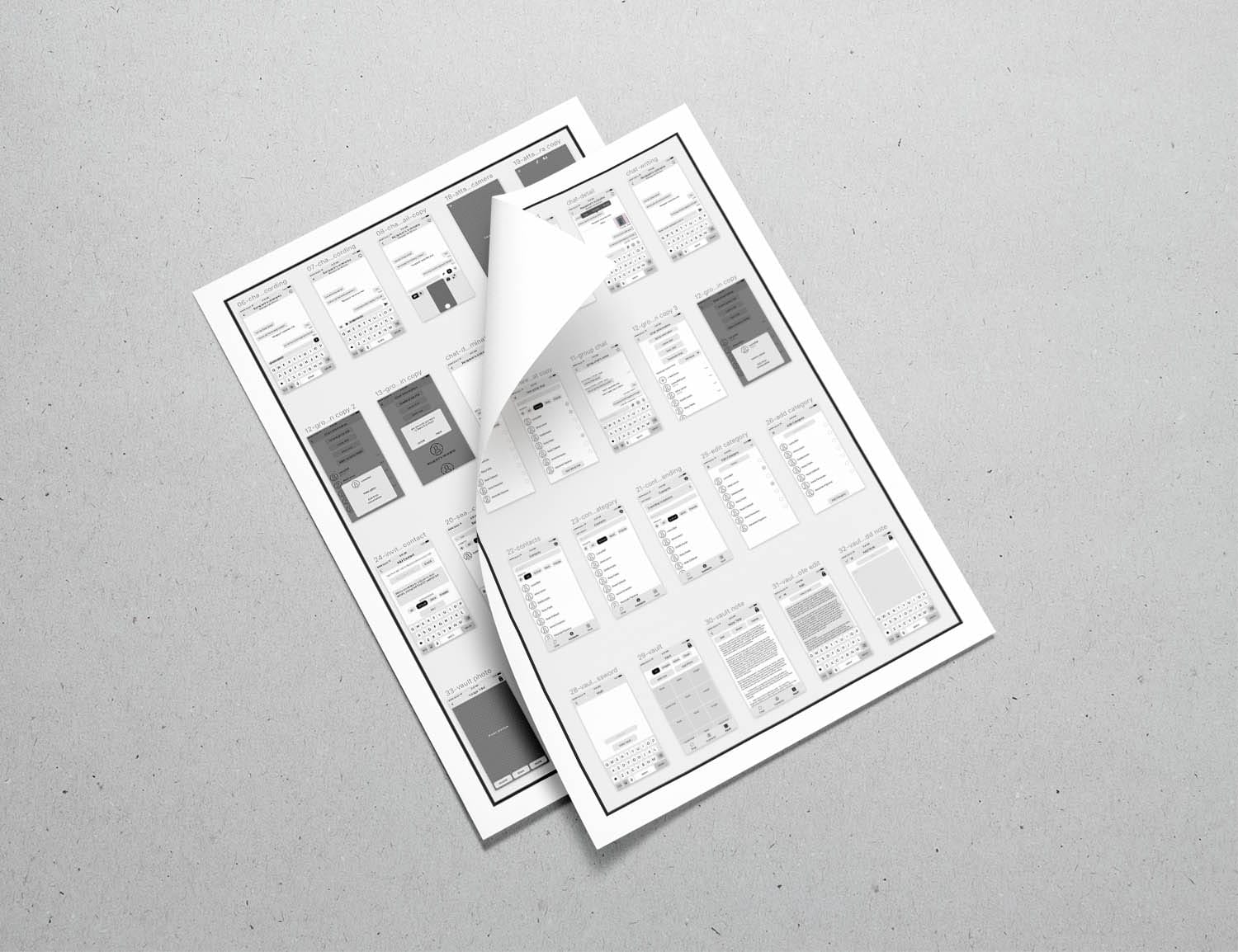
Interactive Wireframes
This was before Sketch 49 was introduced, where they added native prototyping inside sketch with support for Zeplin. Once Sketch introduced version 49 we gave it a shot with a couple of our projects and the results were simply amazing. Sketch + Zeplin turned out to be a much better experience than Sketch + Craft.
To read more on my thoughts about Sketch version 49 and the future of screen design, you can head over to my blog post:
Sketch's new update is too little too late

Yesterday, after a long quiet period Sketch announced their new version. Sketch 49. It come with some basic prototyping features and one of the main new updates was an official Apple integration for iOS 11 UI kit. It all sounds great, but if you take a closer look it starts to fall apart.
Read More
Logo Design
The logo design instructions were simple. A unique icon with two elements that would represent chat and security.
My first attempt was a brute force of all possible options. I made a few different chat icons, and a few that would represent security and I mixed and matched all of the options possible.
My first attempt was a brute force of all possible options. I made a few different chat icons, and a few that would represent security and I mixed and matched all of the options possible.
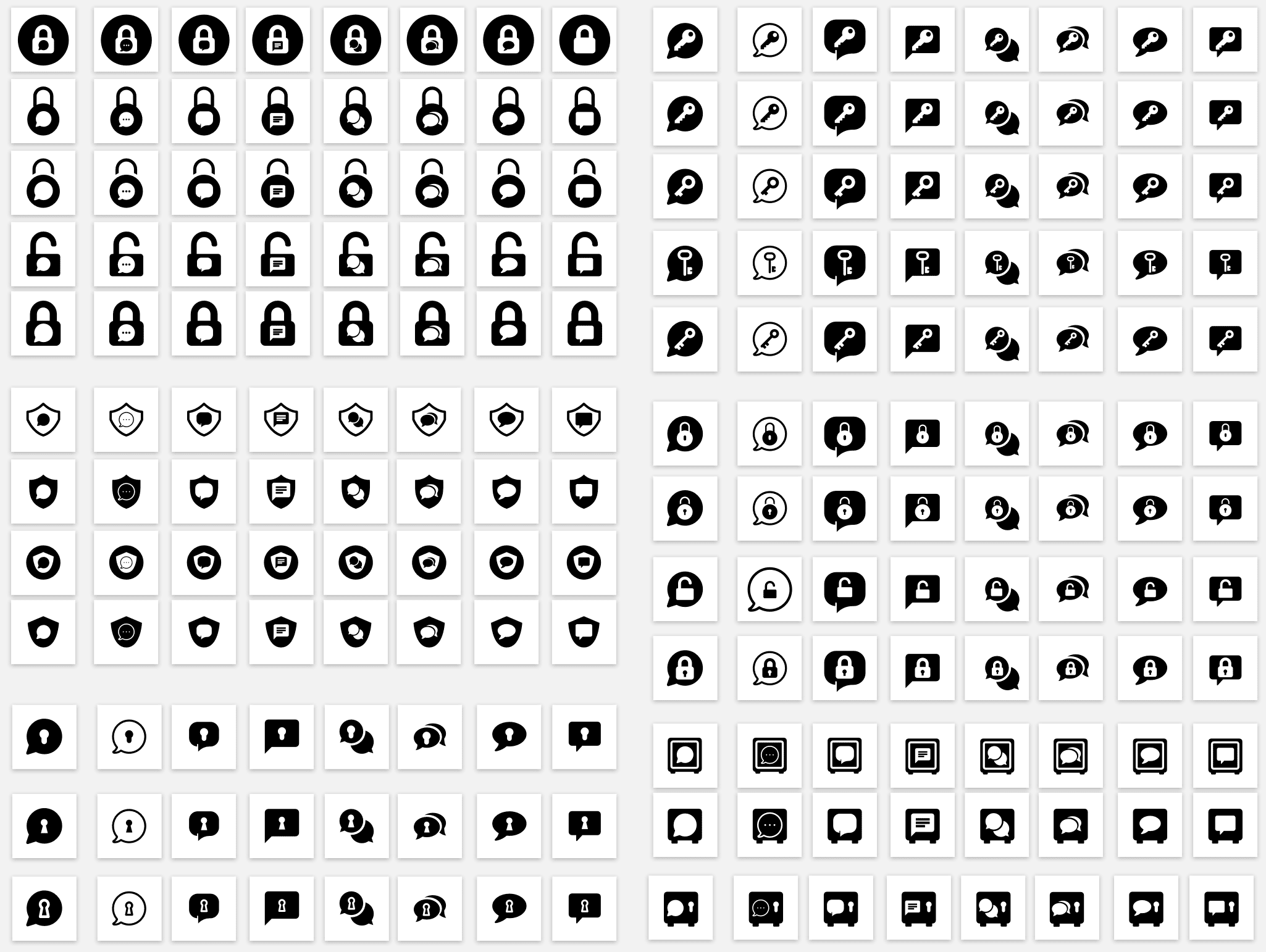
What sounded like a very good at first, turned out to be not so effective later. But that's not a problem. A good designer should learn from mistakes and move forward quickly. Actually, everyone should do that in regards to most things in their lives...
All the effort wasn't for nothing, though. There were some icons that emerged from the endless variations that the stakeholders really liked:
All the effort wasn't for nothing, though. There were some icons that emerged from the endless variations that the stakeholders really liked:

But none of these had the feeling we were looking for. Moving forward, I took a more conceptual approach and came up with a few icons that would represent security and communication in a more abstract way. The results were rather interesting:
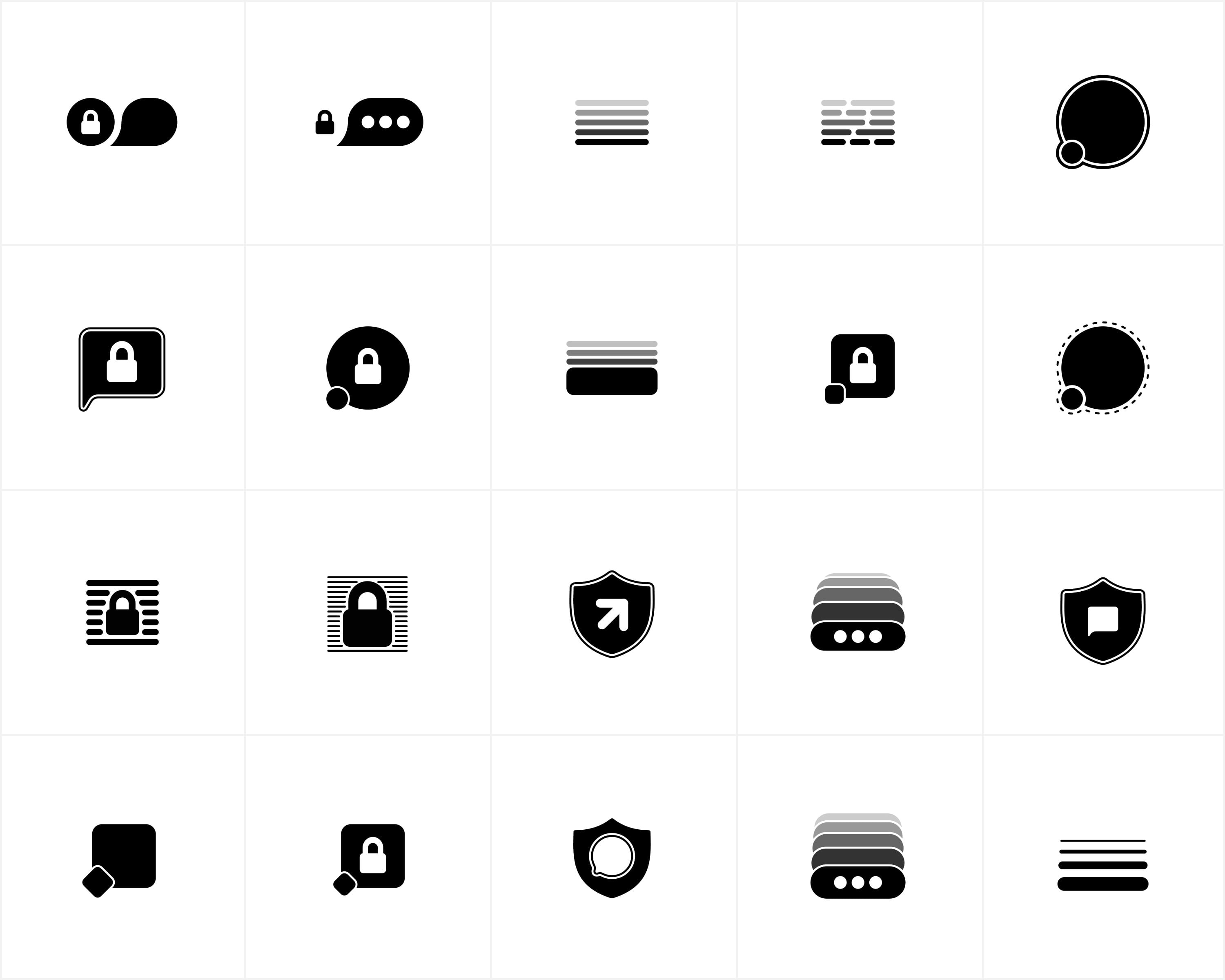
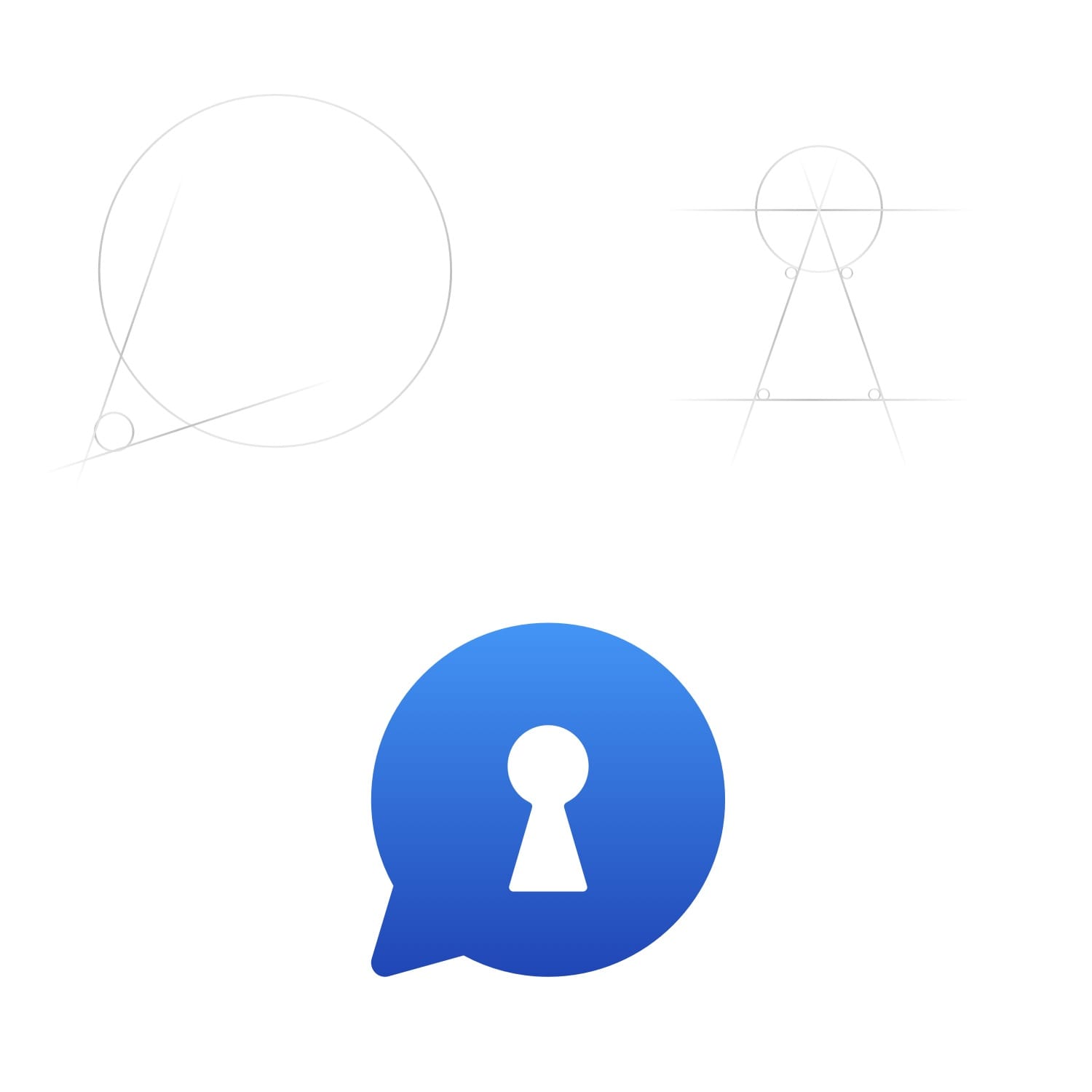
We ended up picking our favourite chat bubble with a keyhole in the middle as the final logo. The final decision was between a keyhole and a lock. Although a lock seems more secure, it could also be interpreted negatively. Locked content, blocked users, and passwords are associated with a lock, but a keyhole has an exciting element to it. You peek through a keyhole to see what's on the other side. A key hole shows that this app is secure and also that it can be easily unlocked by the right key/owner to reveal all of the exciting content!
Starting Development
At each sprint-planning meeting I keep an eye open for any front-end development that will be taking place. If there are any, I make sure to have a meeting with the developers to go over all of the screens and go through every single detail and make sure no stone is left unturned. I make sure the transitions between the screens, the haptic feedback, and the sound effects are all properly communicated.
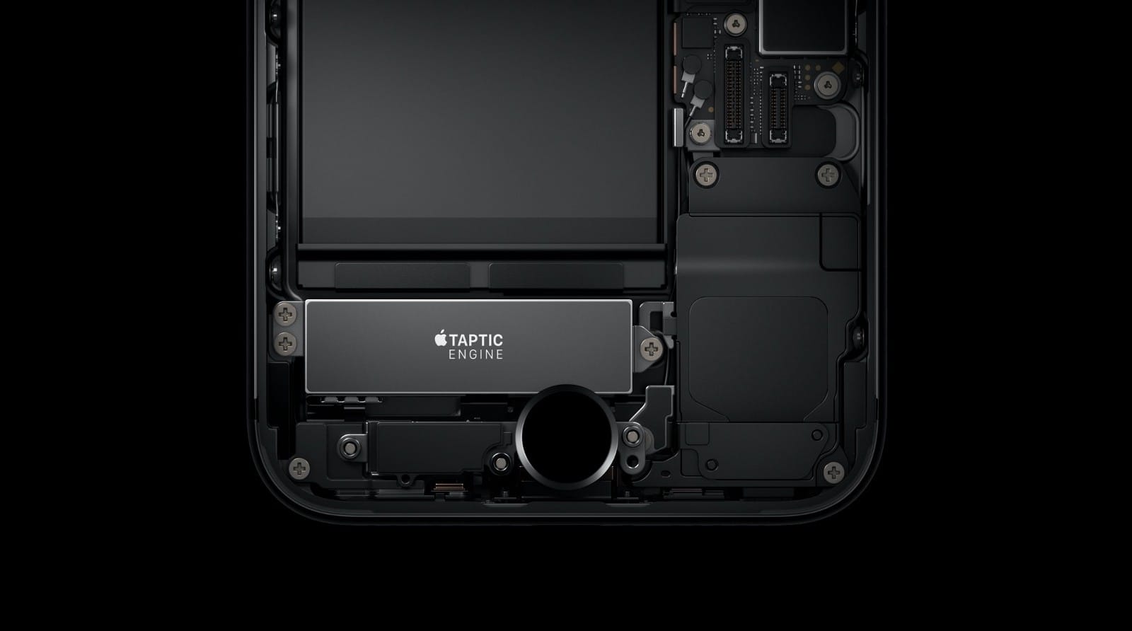
We needed a custom animation for a screen where the user would move their finger on the screen to generate a random encryption key. I came up with the idea of using an animation that matches the speed at which the user is moving their finger, and taking advantage of the Taptic Engine on iPhones to communicate the progress with the users.
To learn more about Taptic Engine on the iPhone and how you can start designing apps with haptic feedback in them, you can read my article below:
Get Started with iPhone's Taptic Engine.
You’re a UI designer. You’ve heard about the Taptic Engine on the iPhones and watched the developer videos where Apple encourages you to integrate them into your design. At first you thought, it’s only on the iPhone 6S. It’s a small market. Then the next iPhone came and you procrastinated more. And now it’s maybe too late to get started with it?
Read More
Micro Interactions
I like to always add a little extra something to the interface to make it feel more interactive and fun. There is a little bit of magic when haptic feedback, sound, and animations come together to create the perfect experience.
Take a look at this example where a user is asked to enter a password to enter the gallery. When the user inputs the wrong password, the "Notification Error" Taptic Engine response is played, along with the sound of keys failing to open a lock, accompanied by the animation that shows the attempt was not successful.
Take a look at this example where a user is asked to enter a password to enter the gallery. When the user inputs the wrong password, the "Notification Error" Taptic Engine response is played, along with the sound of keys failing to open a lock, accompanied by the animation that shows the attempt was not successful.
The only thing remaining was to design the successful experience for unlocking the gallery. The "Notification Success" Taptic feedback with the unlocking animation seemed to do the trick.
Landing Page Animation
I decided to add a cherry on top by creating a custom animation on the landing page of the marketing website. I used WebFlow to create the animation. WebFlow is becoming the leading tool in website design and development and many large companies are chosing it as their main development tool. Fun fact, this website was designed and published in WebFlow as well!
Apps Used
- Sketch for the majority of the design
- MindNode for the mind-maps
- Invision and the Craft plug-in to create the interactive prototype
- Invision to share the assets with developers
- Origami by Facebook to create the custom animations (Generate Secure Key)
- ImageOptim to compress the PNG and SVG assets for developers
- MindNode for the mind-maps
- Invision and the Craft plug-in to create the interactive prototype
- Invision to share the assets with developers
- Origami by Facebook to create the custom animations (Generate Secure Key)
- ImageOptim to compress the PNG and SVG assets for developers