Knowledge is best shared
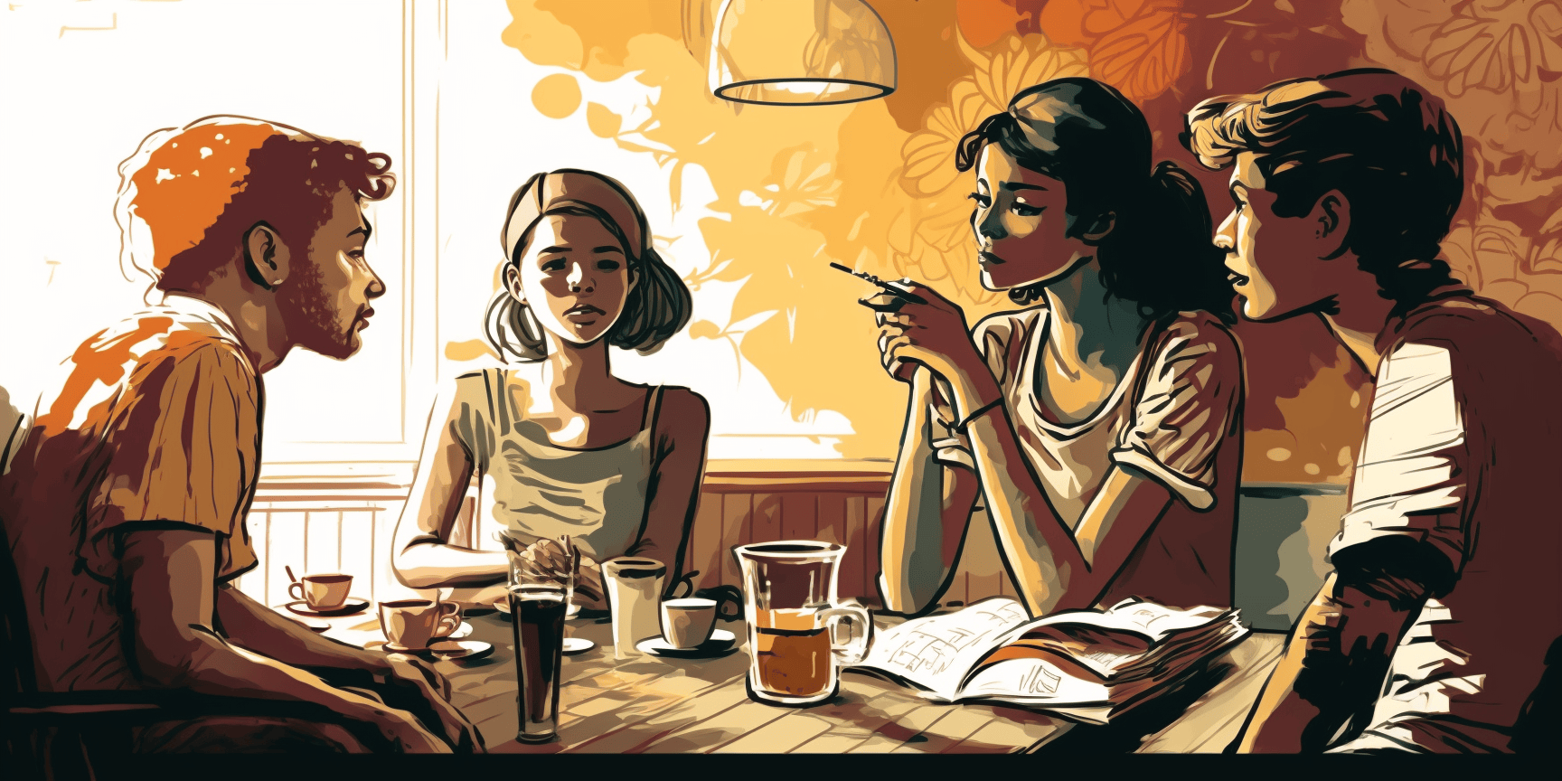
The quote 'Knowledge is best shared' has always resonated with me, and it's become a guiding principle in my professional life. I've pursued several initiatives to help me live by this quote, including publishing articles on
Medium, participating in ToastMasters to enhance my public speaking skills, creating multiple
Figma community files for fellow designers to utilize, and providing mentorship to other designers. It's been incredibly rewarding to see the positive impact these efforts have had on the community.
100+ Research-Backed Articles on Exercise & Health

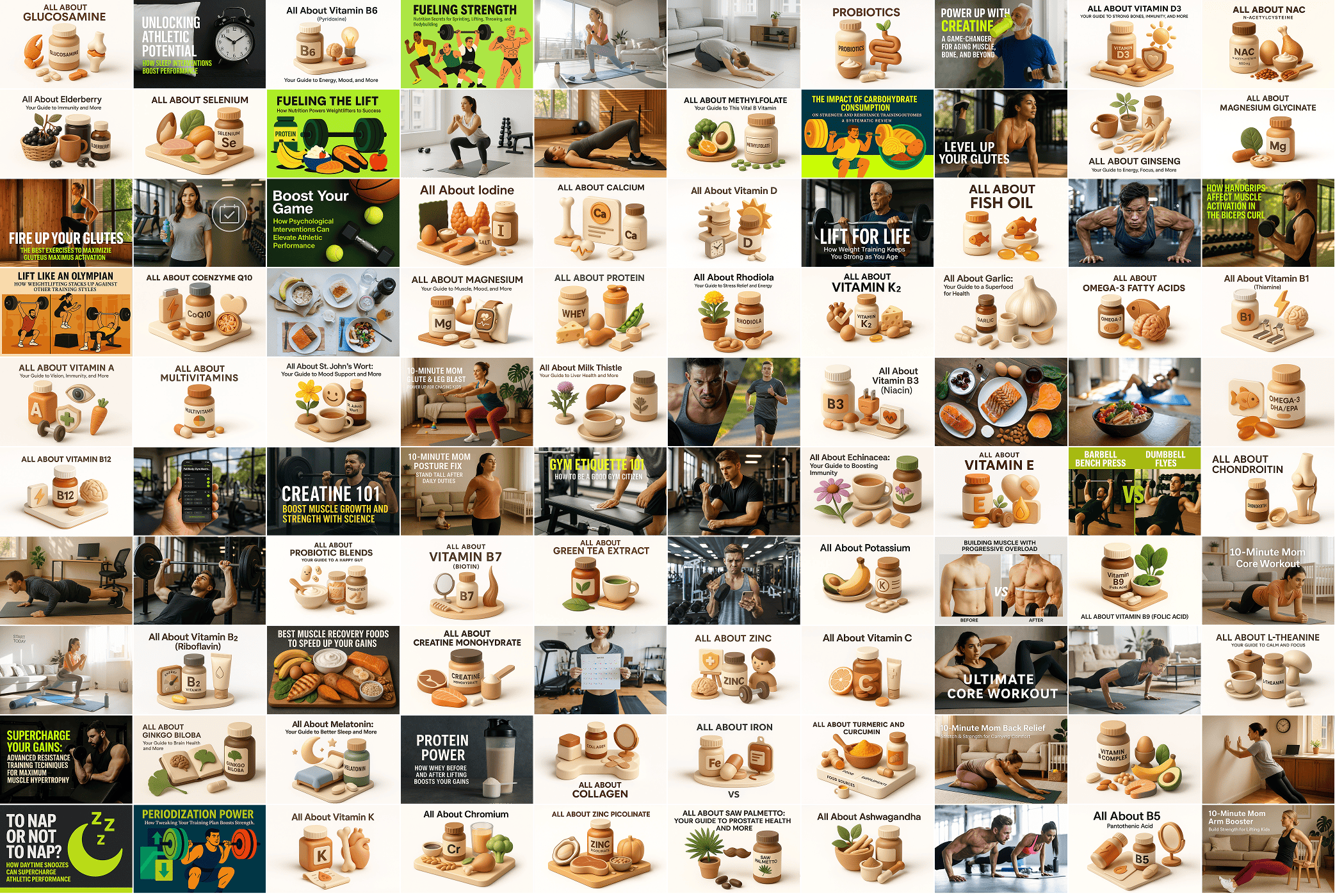
I've created an extensive library of over 100 articles focused on exercise science, health optimization, and fitness. Each article is research-backed and written to help people understand the science behind effective training, nutrition, and wellness. From workout techniques to recovery strategies, these articles cover everything you need to know about improving your health and fitness journey.
View Articles 
How I Use AI to Synthesize User Research Calls in 10 Minutes Instead of 2 Hours

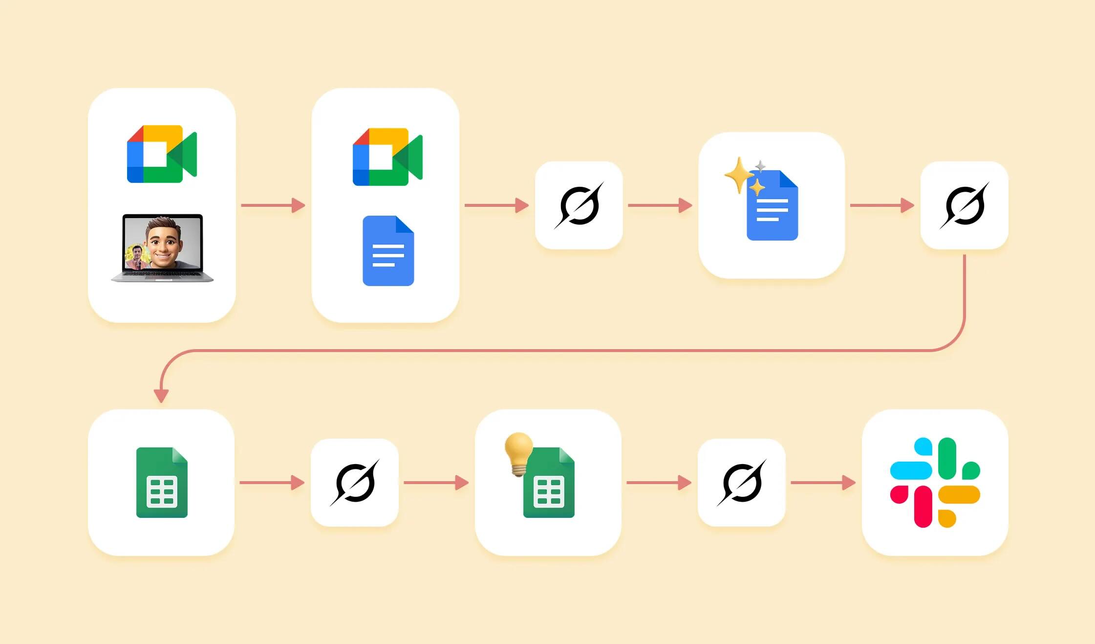
As a product designer, I've explored various user research tools designed to streamline the process of extracting insights from user call recordings. However, many of these tools overlook a critical need: designers often lack the time to manage and process extensive data. Our priority is to quickly distill actionable insights and translate them into impactful design decisions, not to spend hours sifting through transcriptions or manually tagging insights.
Read More
iOS 26's Liquid Glass UI: A Dumpster Fire or Just a Flicker?

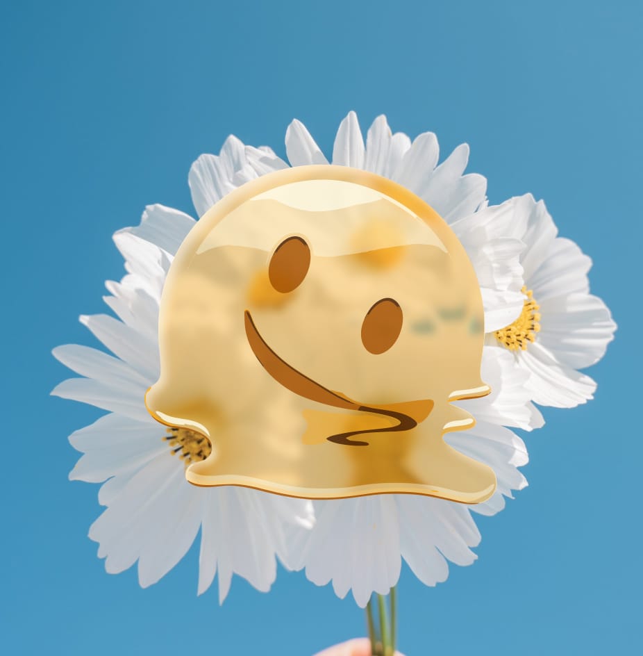
X was a circus today, lit up with reactions to iOS 26's Liquid Glass UI. The vibe ranged from "meh, it's fine" to "who greenlit this abomination?" Below, I've got a chaotic collage of X screenshots capturing the meltdown, followed by my take on why this design is getting dragged harder than a Monday morning.
Read More
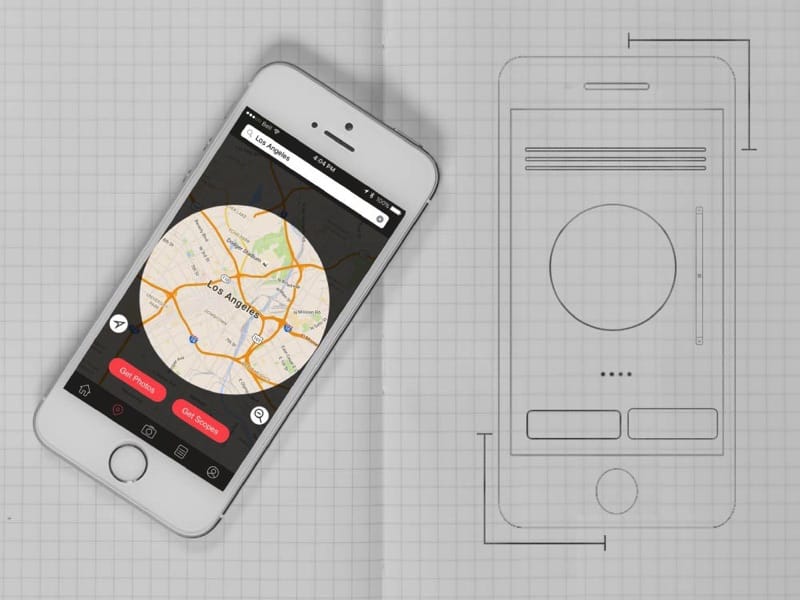
Creating an App Icon with Midjourney
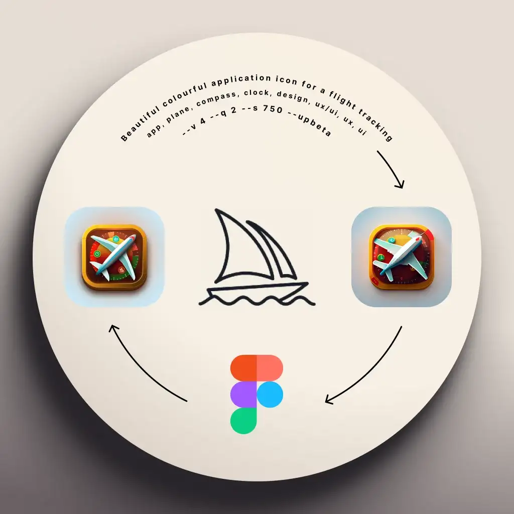
As a product designer, I know the importance of having a visually appealing and memorable app icon. However, not all of us are naturally gifted in graphic design, and that's where tools like Midjourney come in handy. Midjourney is an image generation tool similar to DALL-E 2, and I've been using it to explore different styles for my app icon.
Read More
Staying Focused and Productive: 6 Tips for Updating Your Design Portfolio After a Layoff

With the recent layoffs in the tech industry, many designers are now finding themselves in a difficult position, trying to stand out in a competitive job market. If you're a designer who's currently working on building or updating your online portfolio, here are six things you can do to be more productive while staying sane and motivated to increase your chances of landing a job or freelance project.
Read More
Design Without a Designer: A 3-Part Series

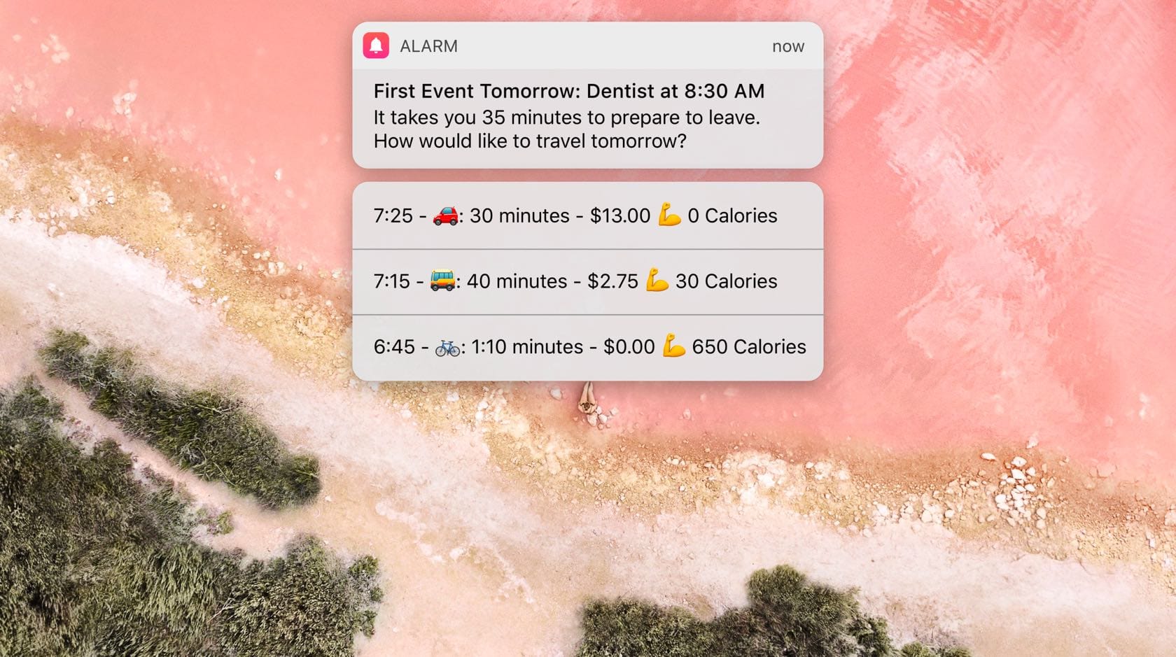
A 3-part series on design thinking for non-designers. Starting with questioning everything and how a simple alarm clock can become something extraordinary, then covering logo design basics and what makes a good logo, and finishing with a hands-on logo design tutorial in Sketch.
Read More
Does your app need a night mode?

With the introduction of OLED screens to the iPhone X, more and more people are requesting night themes in their favourite apps to take advatage of the true blacks on OLED screens, to save battery, and to make it easier on the eyes in some cases. But should you add this…
Read More
Sketch's new update is too little too late

Yesterday, after a long quiet period Sketch announced their new version. Sketch 49. It come with some basic prototyping features and one of the main new updates was an official Apple integration for iOS 11 UI kit. It all sounds great, but if you take a closer look it starts to fall apart.
Read More
What I learned as a design mentor in a hackathon and how it helps me every day

About 2 years ago I volunteered as a design mentor for the Van{Hacks} hackathon in Vancouver. I ended up sleeping in the Hootsuite lounge to make sure nothing went wrong and to provide support to the teams in the form of design feedback and healthy snacks, making me the only mentor who stayed overnight.
Read More
Why the Future Has No Room for UI Designers

In a few years the interface of most applications will be redundant. Let me tell you why. There are apps that you use to create stuff, then there are apps like games that are immersive experiences. Pretty much everything else is about consuming information...
Read More
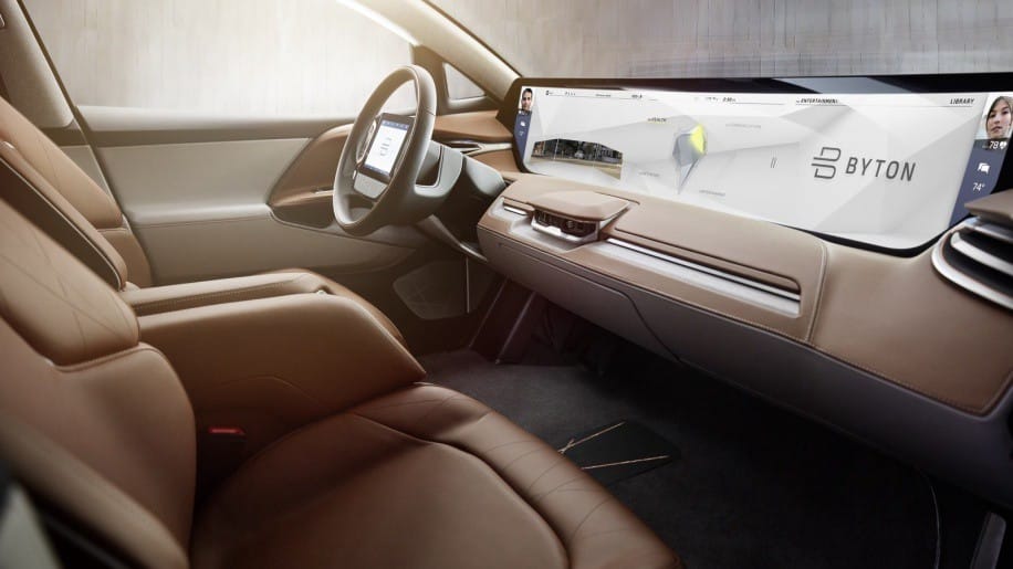
The right way to make a dashboard for self-driving cars.

Another CES passed by and we saw a bunch of new smart cars, with self-driving capabilities. What all of them had in common, was how they were trying to be the center of your digital experience.
Read More
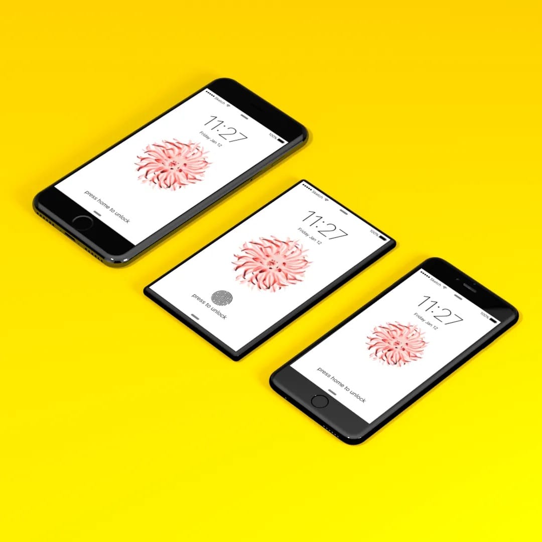
The Inevitable iPhone 8

After a visit to Cupertino and getting the silent treatment from all of the Apple engineers I tried to talk to about the next iPhone, I started thinking what the next iPhone would actually look like. This was before all of the rumours about the iPhone X
Read More
4 Reasons Design in Marketing Matters More Than You Think
"Think of your branding as an outfit. It tells a lot about you. Even if you're the most qualified person for a job, if you dress poorly for an interview, you might not get the job."
Why Apple is the only company that can make the iPhone killer.

In this article I'm going to talk about the future of the iPhone and how Apple is going to kill their most profitable product...
Read More
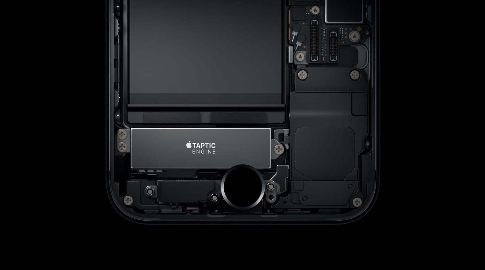
Get Started with iPhone's Taptic Engine.

You're a UI designer. You've heard about the Taptic Engine on the iPhones and watched the developer videos where Apple encourages you to integrate them into your design. At first you thought, it's only on the iPhone 6S. It's a small market. Then the next iPhone came and you procrastinated more. And now it's maybe too late to get started with it?
Read More
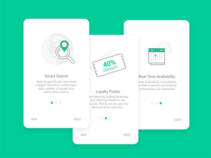
Does your app really need on-boarding screens?

Some apps have dedicated on-boarding screens. Some let you skip them and some don't. Some apps are only accessible with an account and when you open them you are presented with a log-in screen. Some leave this as an option and let you log-in later by experiencing the app first, to see if it's really for you, and some don't. So which is the right approach for your app?
Read More
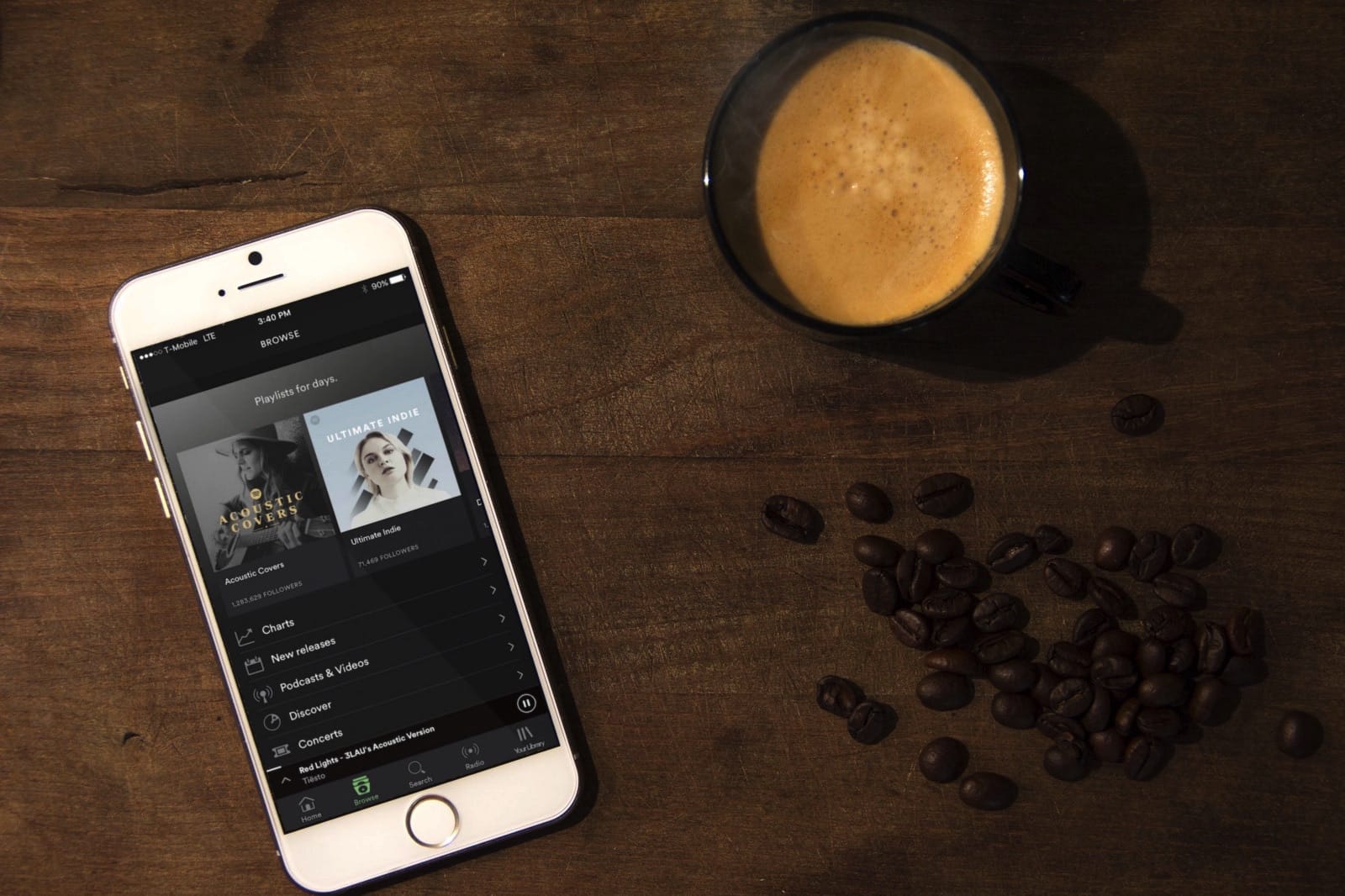
Spotify finally fixed the most annoying thing about their app!

They have replaced the burger button with a tab bar. Every good user experience needs to provide these pieces of information to the users: Where they are, where they can go, and how they can get there...
Read More
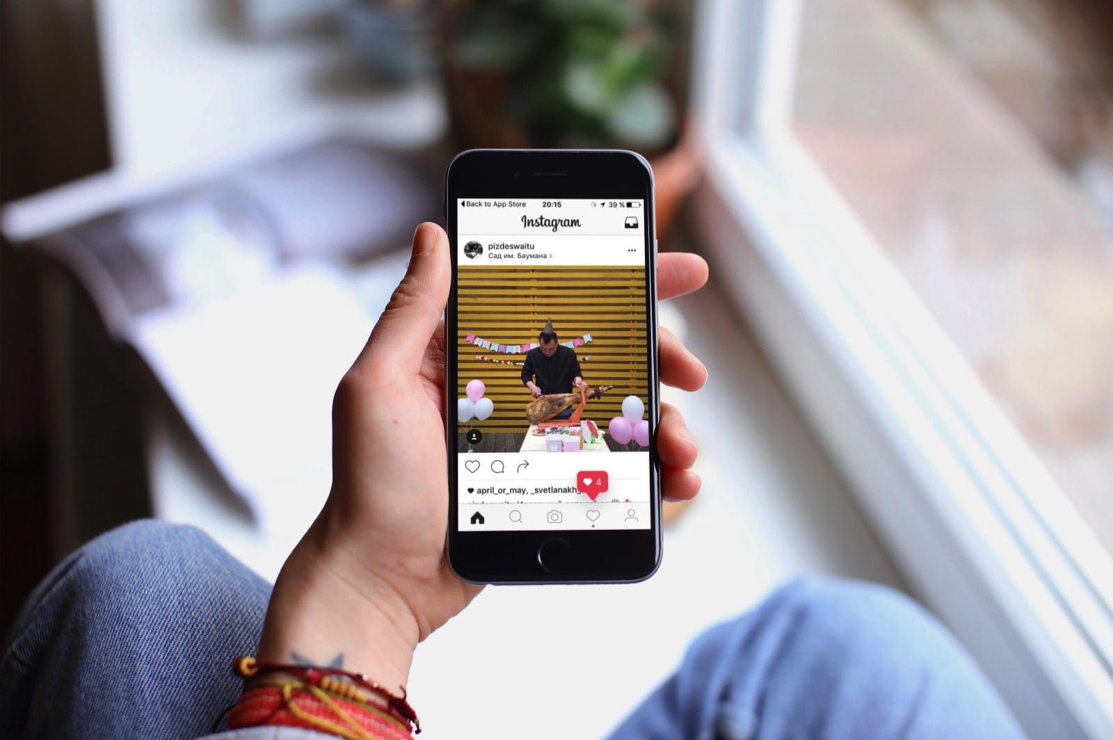
Why Instagram's decision to go black and white is great for their users

Instagram has been testing a somewhat radical new user interface of their app. A black and white approach to the infamous social media app with hints of red here and there. Here are a few reasons, why I think this is perfect for the users: The newly designed tab bar uses black, thick icons for the selected tabs and thin, grey outlines for the unselected ones...
Read More
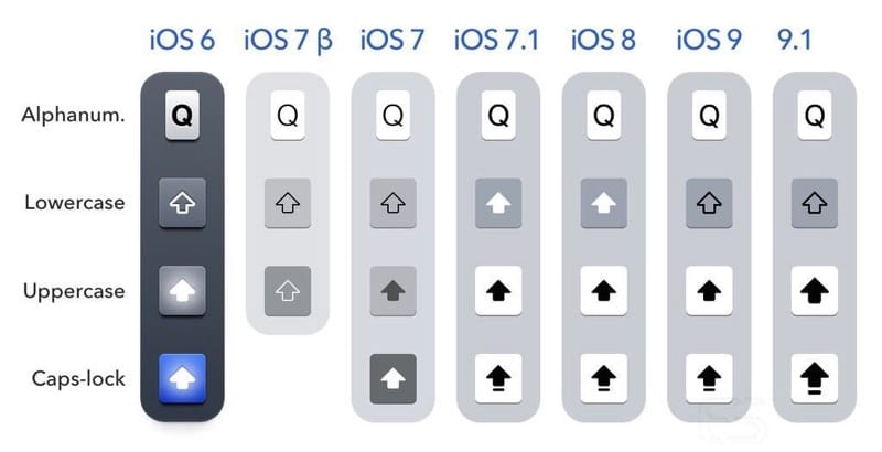
How can Apple fix its shift key problem once and for all

I will not be getting into the history of the shift key and how Apple has tried to get it right over and over again and failing each time in one place or the other. To get a detailed history and for an amazing read check out this article...
Read More
Public Speaking
I remember the first time I watched an Apple keynote presentation. It was amazing! I made it my purpose to present all of my university projects just like an Apple keynote!
A few years ago I joined Toastmasters to improve my public speaking skills. In this page I want to share with you some of the presentations and speeches that I gave and I hope you enjoy them!
WWDC Vancouver Panel Discussion
After the 2018 WWDC event, Lighthouse Labs and ViDIA held a panel discussing the new announcements just made by Apple. I was honoured to be invited to be part of the panel! We had an amazing 1 hour conversation followed by a Q&A.
Design Without a Designer
I gave a quick 8 minute speech about how design thinking can be applied to even the smallest parts of your project called "Design without a Designer" at ViDIA's 2018 May meetup.
The Inevitable iPhone 8
I was honoured to be asked to speak at the 2018 February ViDIA meetup group to talk about an iPhone 8 concept design that I've been working on, for a 20 minute presentation.
Presentation on PaintCode (ViDIA)
In 2015 I decided to start using PaintCode instead of Photoshop for UI design. I know! What was I thinking? Photoshop? Anyway. I started to explore the possibilities of PaintCode and even made a
fully working and customizable clock in it! I decided to share my knowledge and what is possible in PaintCode with the attendees on ViDIA during one of the meetings.
About Me - Ice Breaker Speech at Toast Masters
Every Toast Masters member's first speech is the Ice Breaker, where they talk about themselves, their background, what motivates them and where they want to go in life. This is my ice breaker speech. I hope you enjoy it.
Winning speech at table topics contest
Table Topics are one of the more challenging parts of being a Toast Master. You are asked a random question and have two minutes to give an answer in a proper public speaking format. My question (luckily) was about dealing with difficult customers. I had a lot of experience dealing with *cough* *cough* I mean all of the people I have worked with are very professional and never have I ever had any problems with anyone. Anyway, I managed to "make something up" and my speech won me the "Best Table Topics" badge.
