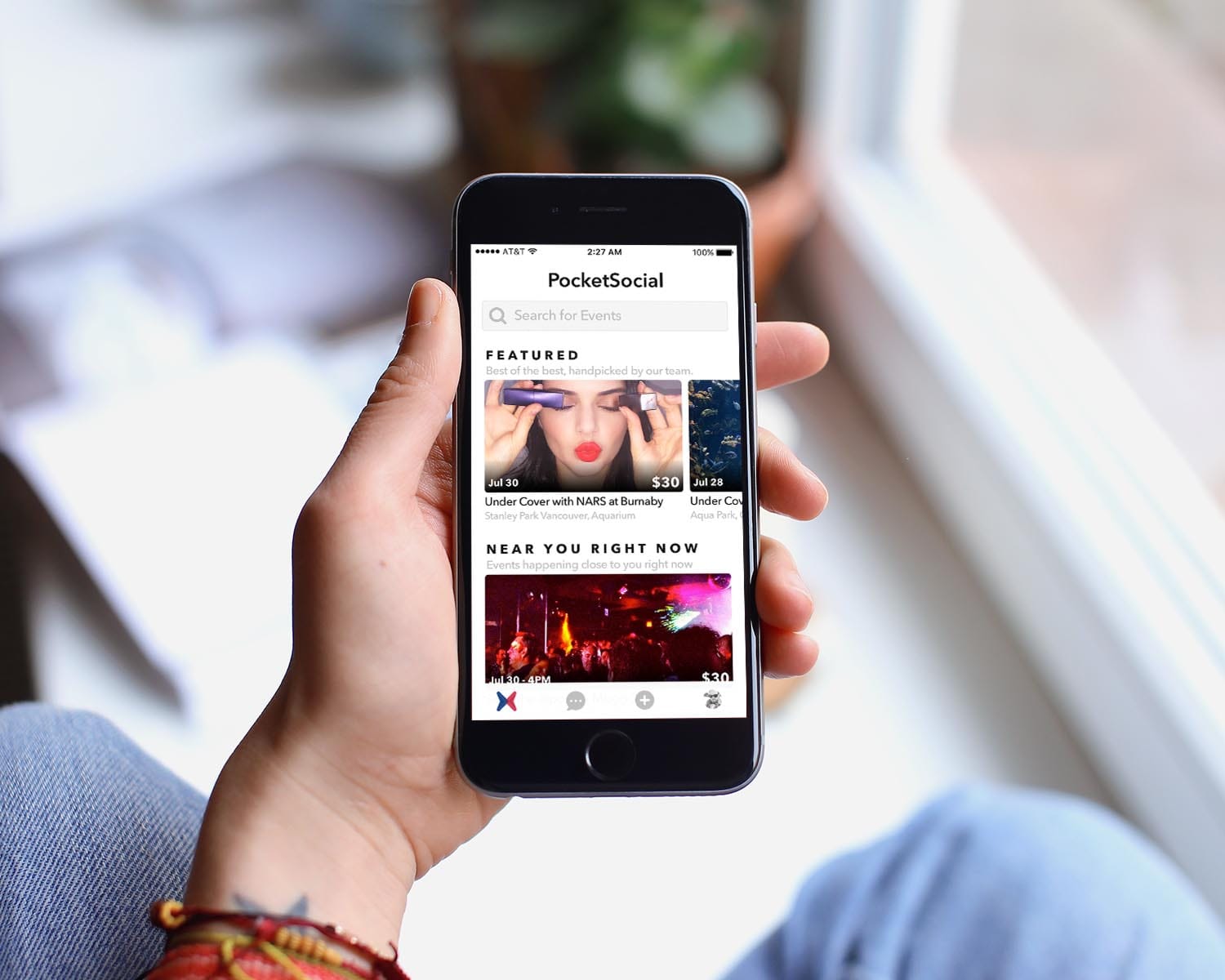
Pocket Social
Pocket Social is a platform for events of all kinds to bring people together. In this showcase page I'd like to highlight a few steps I took to fully re-design the app. Our main focus for the re-design was to bring a new look and feel, as well as a fresh, frictionless interface.

Create Event
The process for creating an event was long and confusing in version 1. One of my main tasks was to re-design this process. All of the steps were to stay in the process. My only path moving forward was to improve the information delivery. How much is shown and when. Creating an event was a crucial part of the interface and it had to make sense to everyone, including the least tech savvy users of our app.
Gamification
To increase engagement and to encourage users to take certain actions, I designed a series of badges that they could unlock and show-off on their profile page. Unlocking a badge shows a fun animation that is meant to peak the user's curiosity about what else they could unlock. A few of the badges were rather easy to unlock, like logging in with facebook. But some other ones were tricky, like showing up to 5 events on time in a row!
To learn more about my other motion graphics projects head over to my Instagram page:
Instagram
Apps Used
- Sketch for the majority of the design
- Cinema 4D for 3D modelling the badges
- Photoshop to create the textures of the badges
- Arnold for C4D to render the badges
- Flinto to create the interactive prototype
- Zeplin to share the assets with developers
- Cinema 4D for 3D modelling the badges
- Photoshop to create the textures of the badges
- Arnold for C4D to render the badges
- Flinto to create the interactive prototype
- Zeplin to share the assets with developers