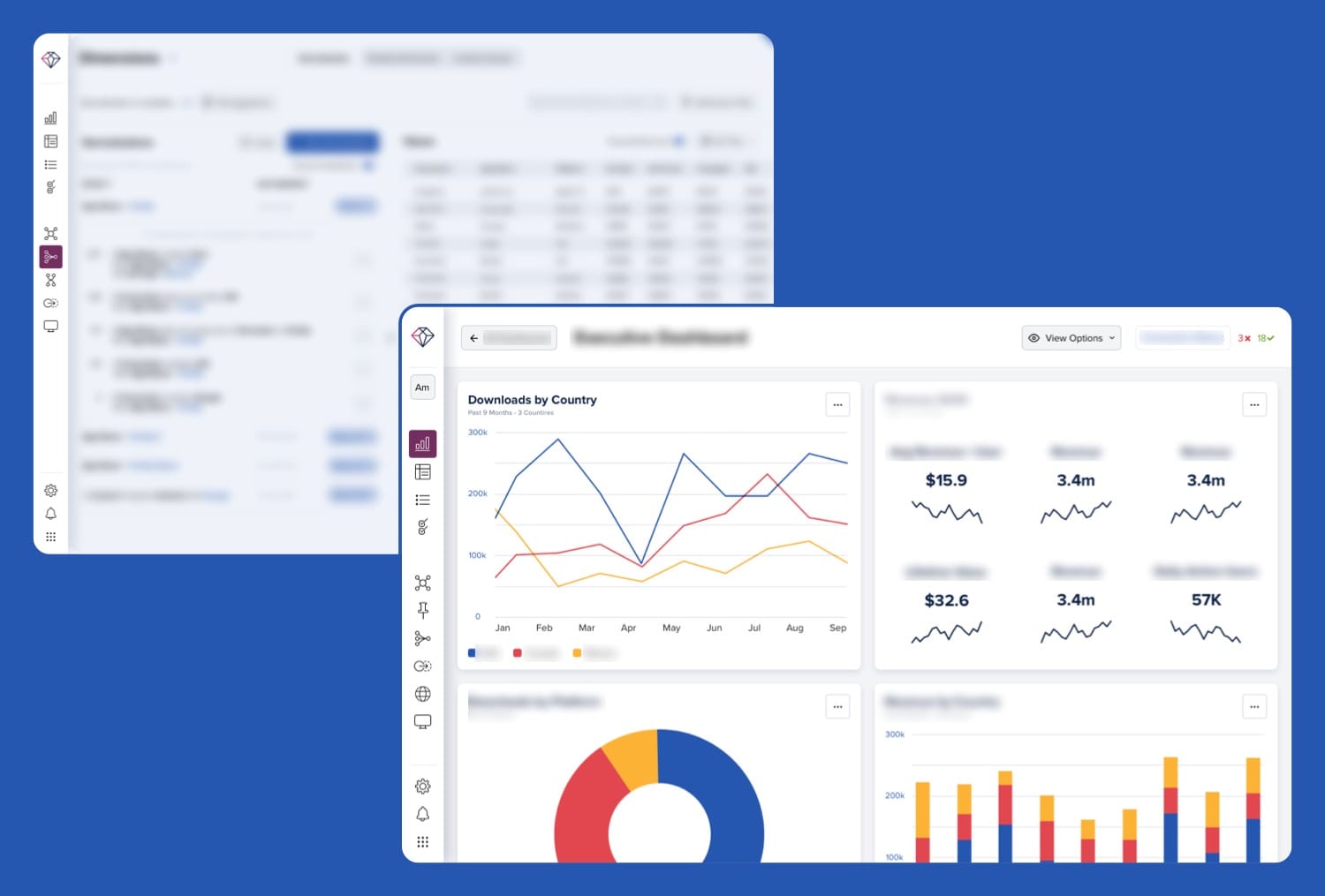
App Annie - Ascend

Project Overview
In late 2019, App Annie acquired a company called Libring with the goal of bringing in most of Libring's features to App Annie customers under the name Ascend. My role as the sole designer for the Ascend project was to lead the entire design process from start to finish.
Read more on Tech Crunch.
Read more on Tech Crunch.
Design Process
1. Familiarized myself with the existing product and worked with project managers and other stakeholders to understand the problem and break the project down into separate features.
2. Created an information architecture based on the user's workflow and developed a new design language separate from the existing App Annie design system and components.
3. Collaborated with developers to create and implement a brand new design system for Ascend, complete with animations, micro-interactions and documentation.
4. Designed high-fidelity interactive screens for all of the features, conducted heuristic evaluations, and validated the designs with customers and engineering team as early as possible.
5. Handed off the designs to developers and ensured a smooth implementation of the design all the way to production.

Animation for first time users
Goals
Short-term goal: Define, design, and deliver the core functionalities of Ascend to developers within 6 months.
Long-term goal: Continuously research and find ways to bring value to existing and new customers.
Long-term goal: Continuously research and find ways to bring value to existing and new customers.

Page loading animation
Challenges
The project faced difficulty due to the disorganized complexity of the current solution. Identifying the primary reasons for customers using Libring and designing a user-friendly information architecture was the most challenging aspect. It was apparent that certain features were added without proper planning, causing a disjointed user experience. Over time, this led to a confusing user experience.


Mindful animations add a sense of thoughtfulness and polish to the experience
Solution
1. Worked closely with PMs and primary stakeholders to summarize the 21 existing modules into their core components, reorganize, rename, remove, and combine some of the modules to create a set of 9 modules that when put together, tell a great story of the functions of the platform.
2. Considered a future where new modules would be added to the platform to introduce new features, and created a flexible information architecture that would not create too much complexity or confusion.
3. Worked with PMs and customers to validate the designs at an early stage, which emerged design patterns and helped to create a design system for the platform.

Subtle movements help guide the user's attention every step of the way
Result
The design of Ascend was successfully delivered to developers within the 6-month timeframe, and the platform has received positive feedback from customers. The design system that I developed for Ascend is now being used across App Annie, which has led to an overall improvement in the user experience.

The previews help users make an informed decision when choosing a visualization