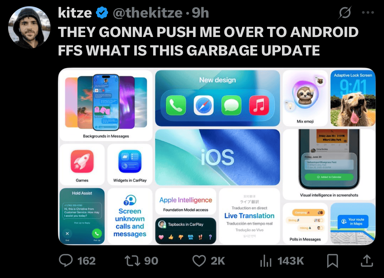
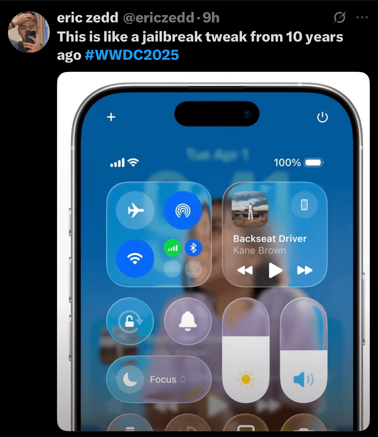
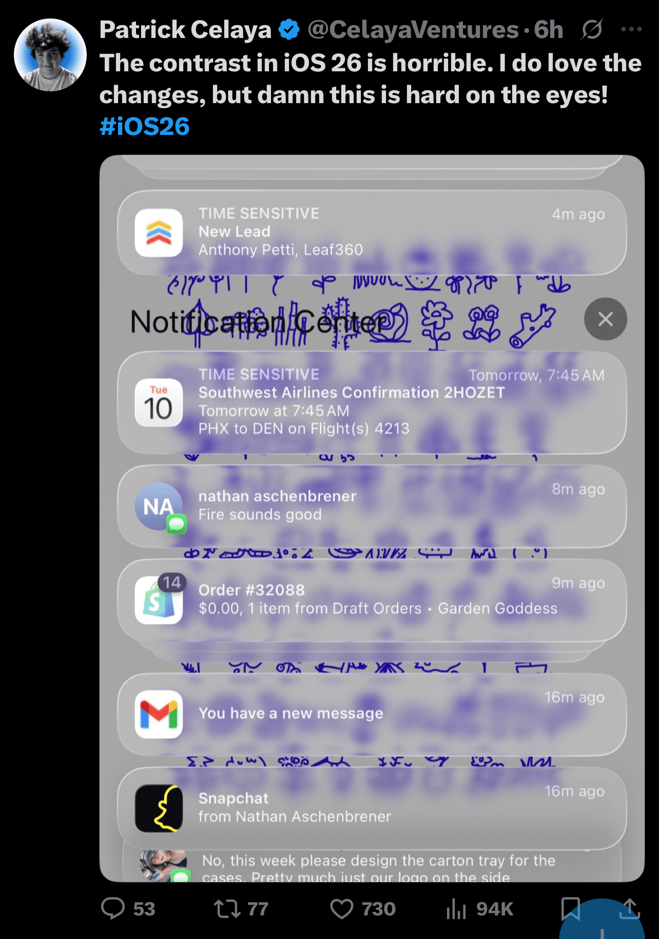
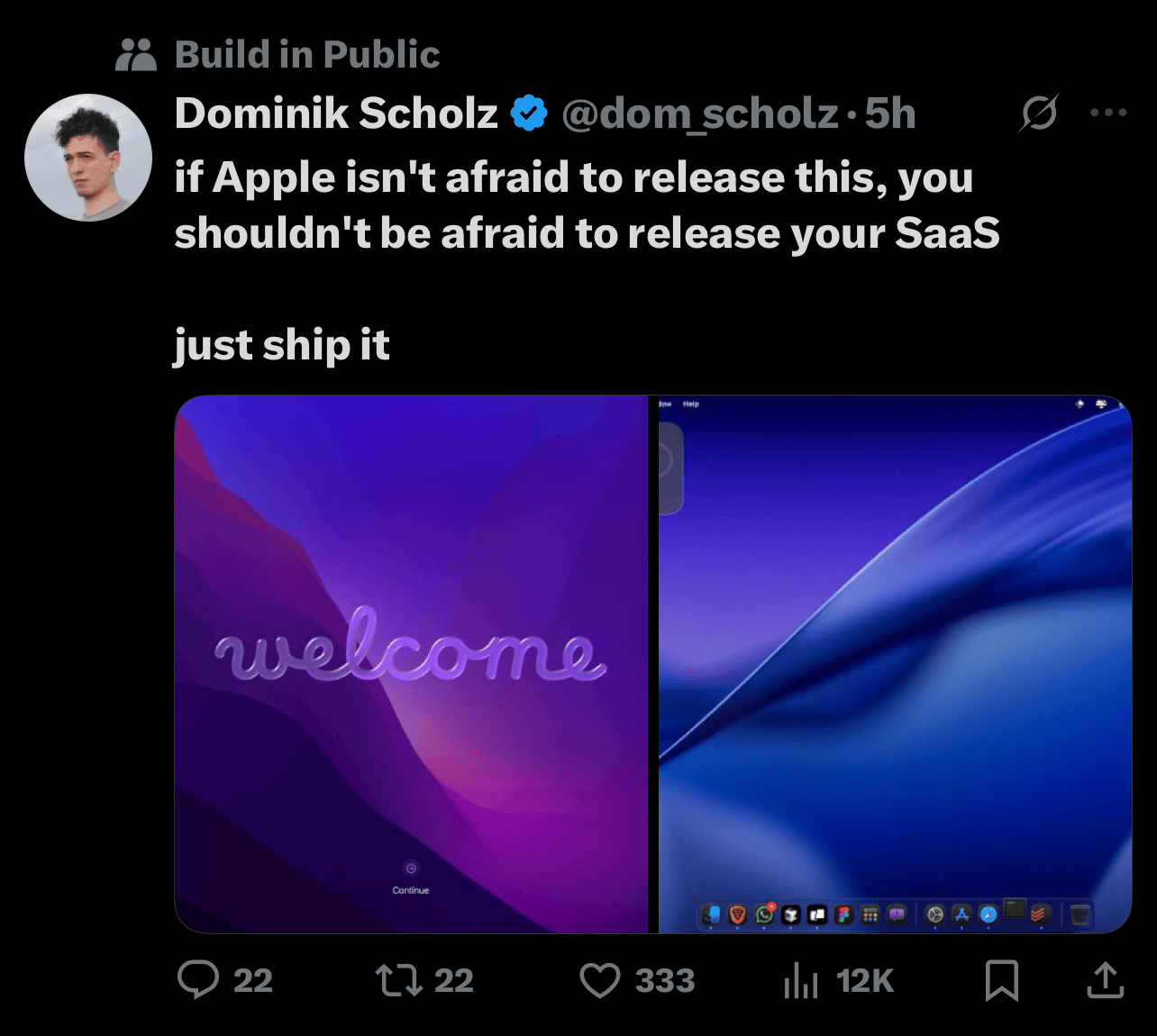
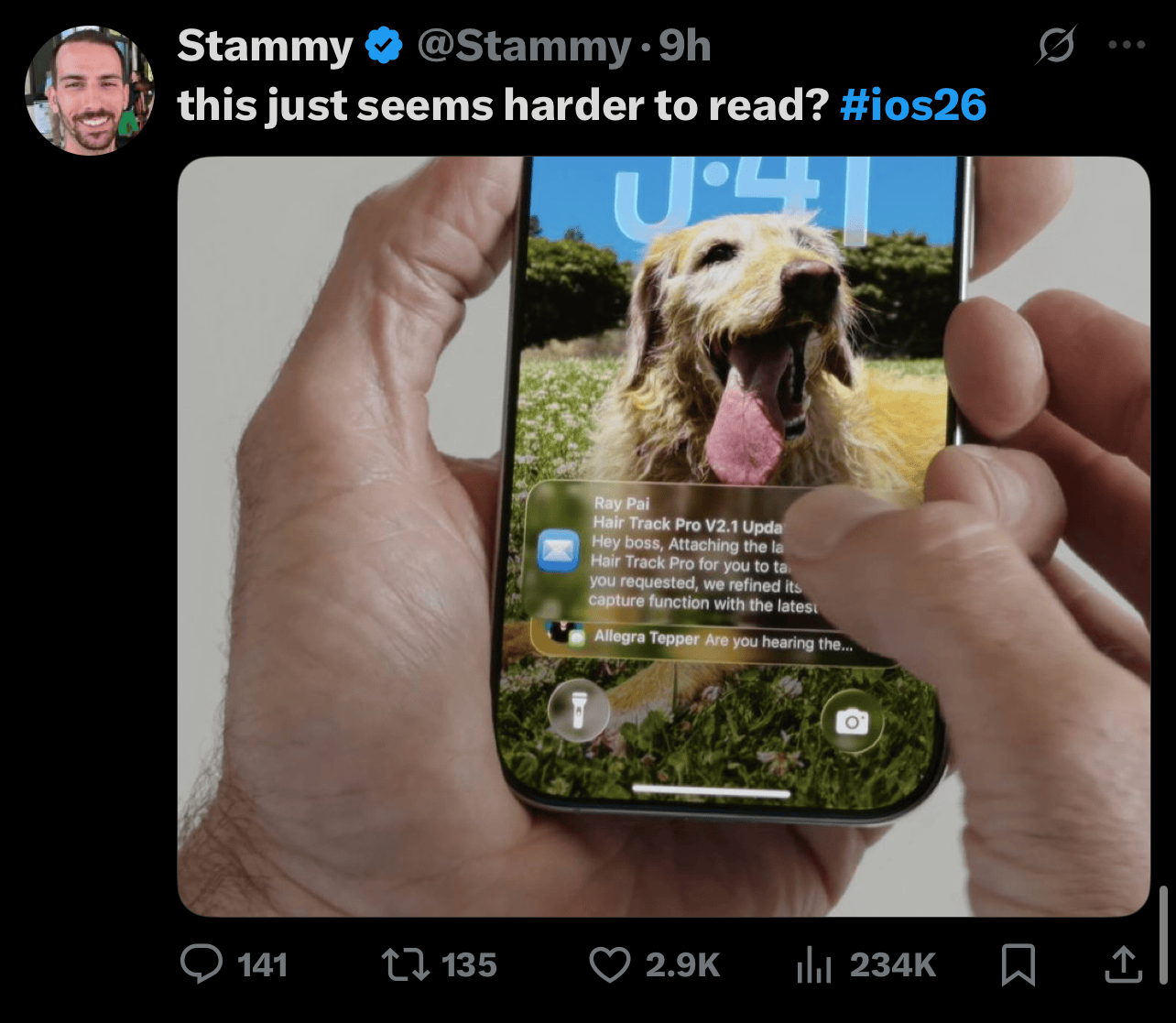
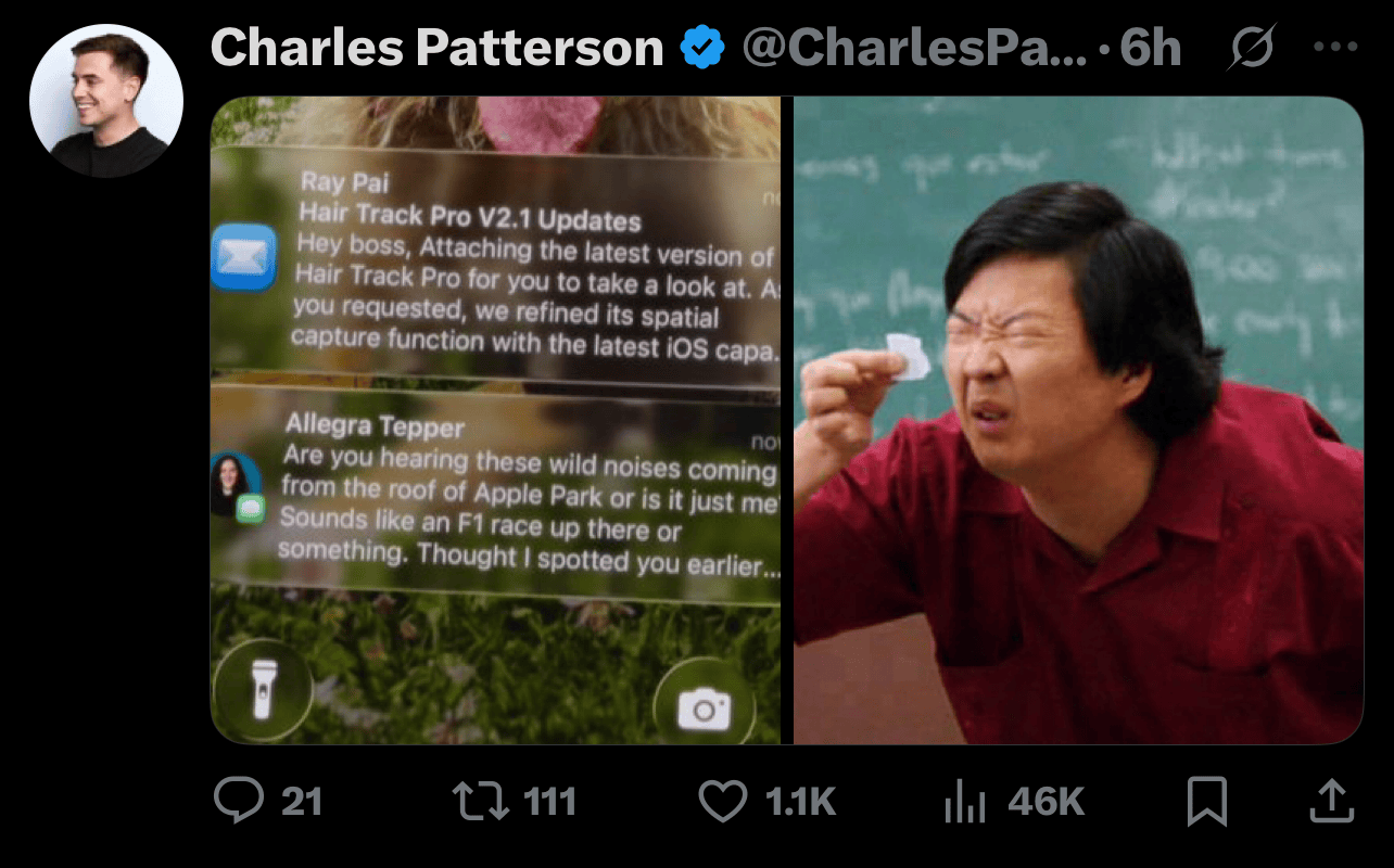
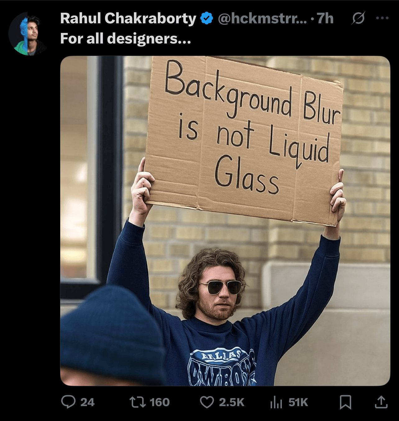
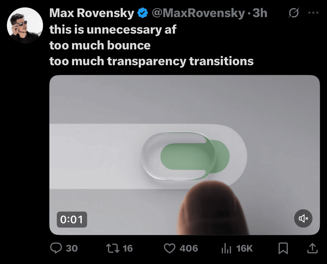
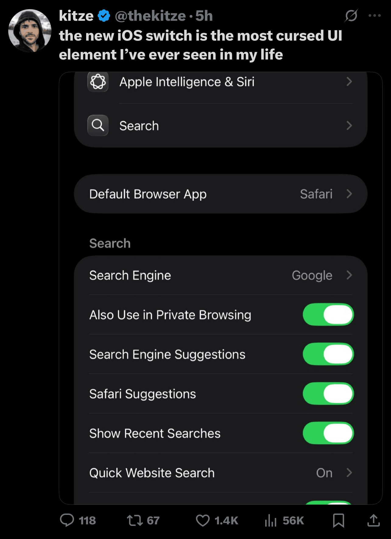
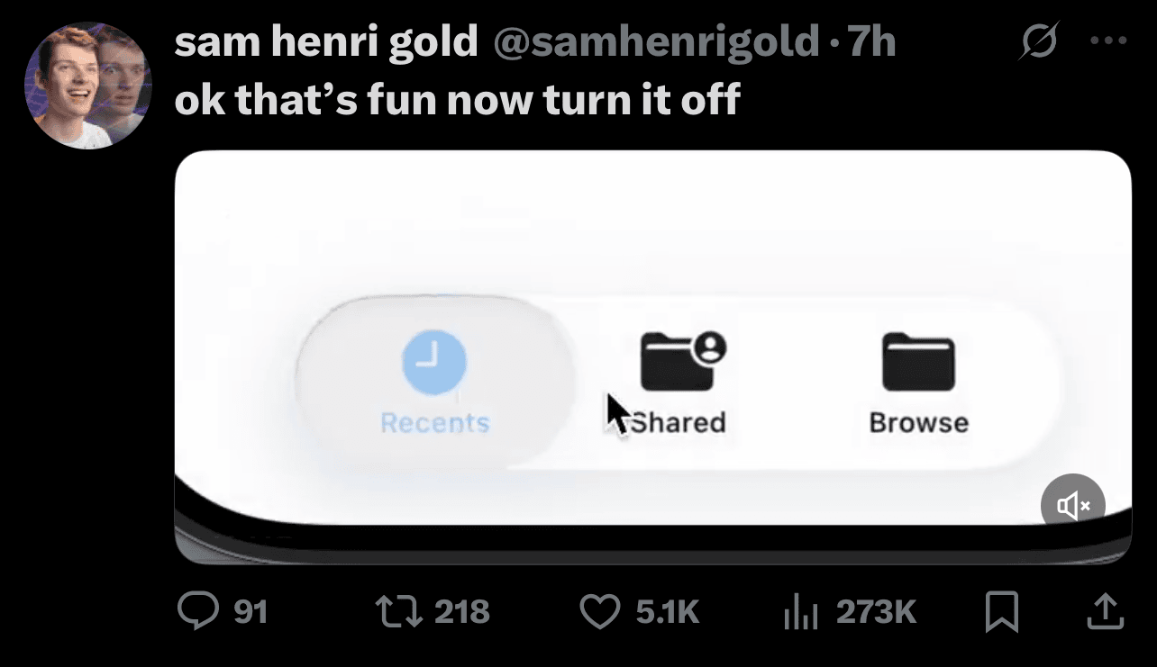
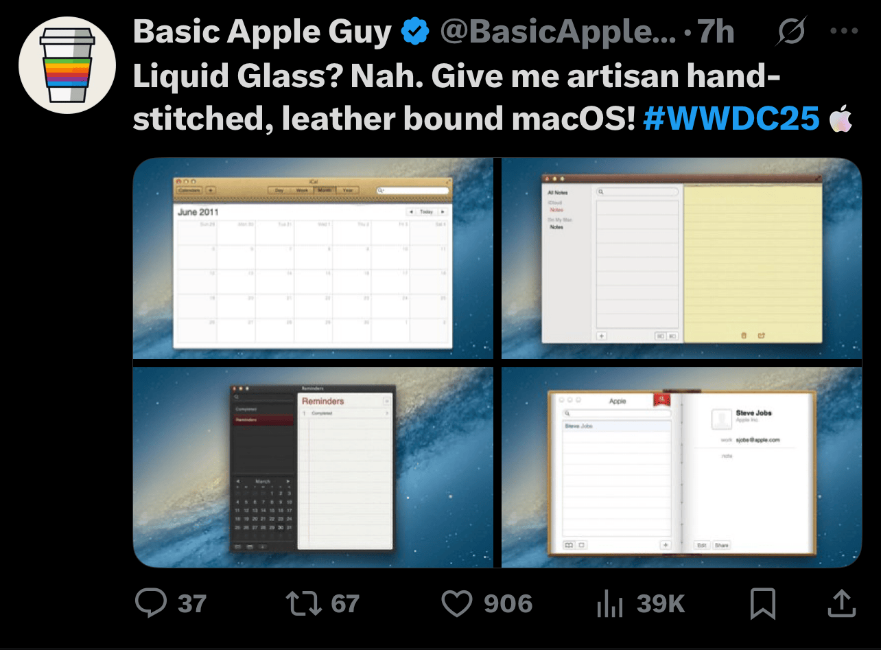
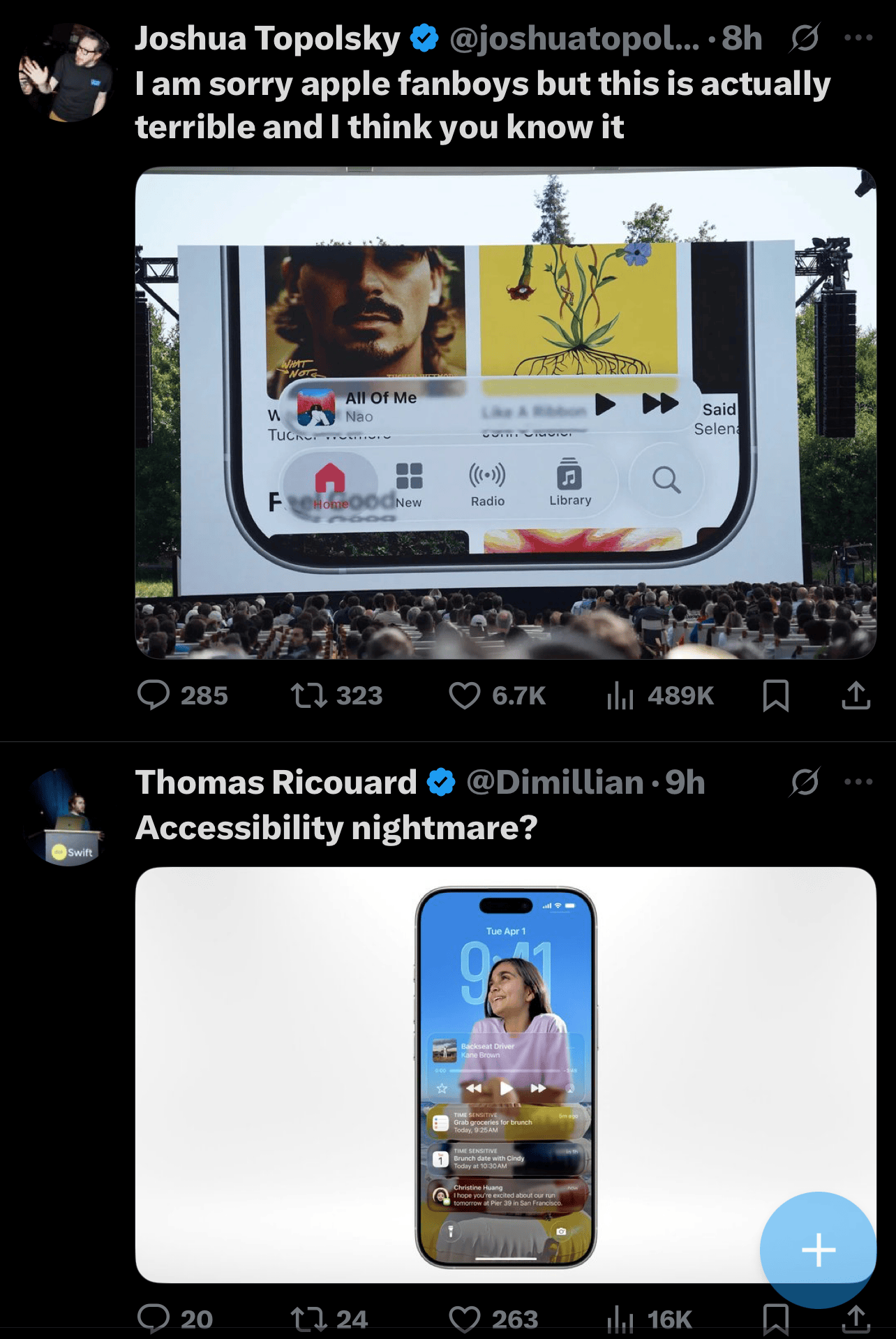
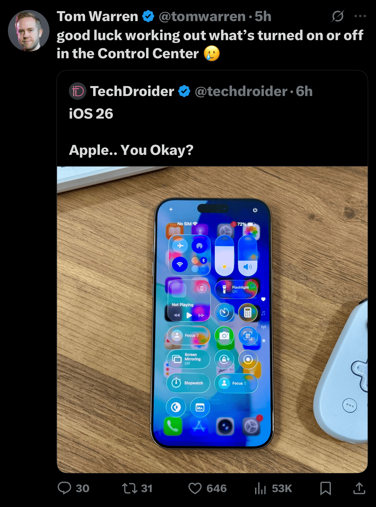
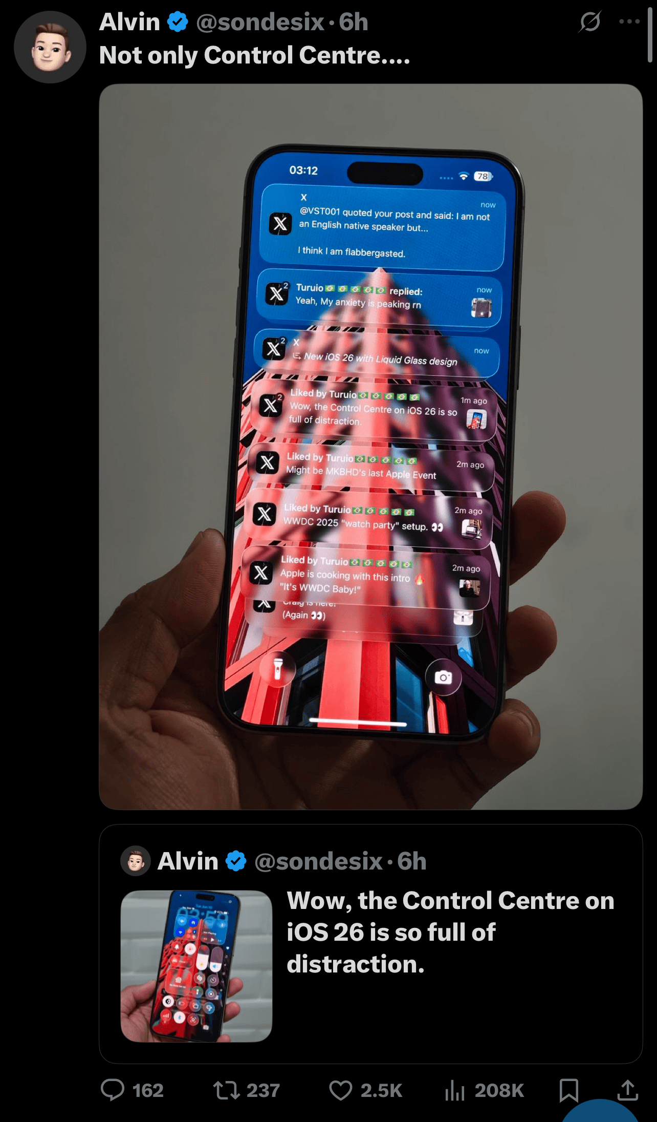
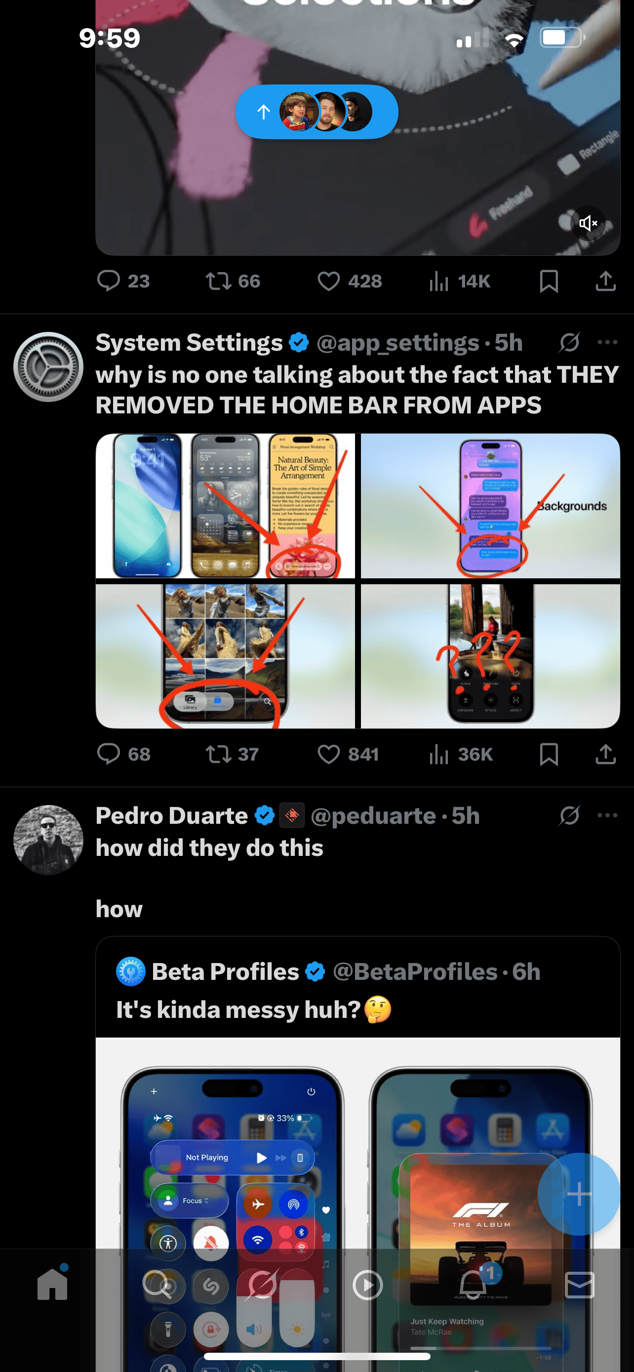
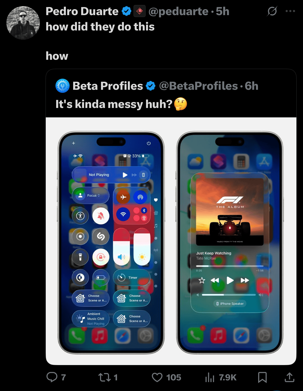
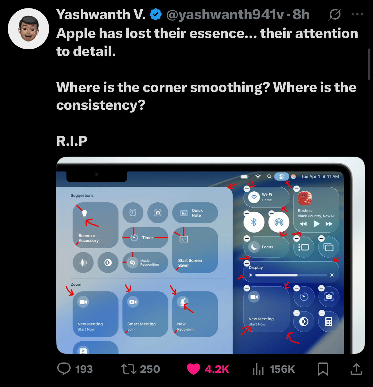
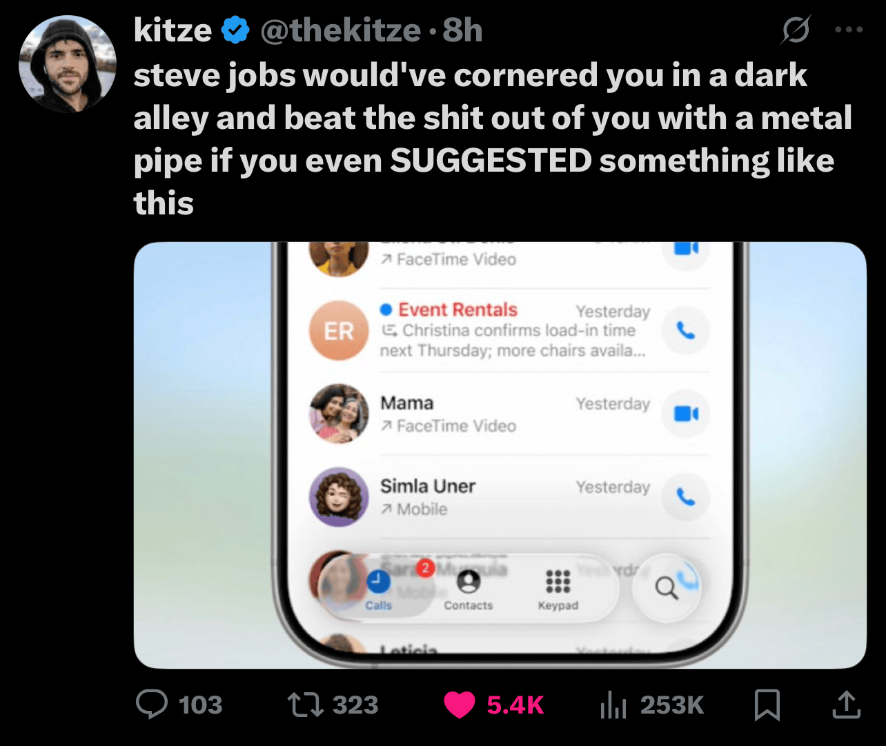
X was a circus today, lit up with reactions to iOS 26's Liquid Glass UI. The vibe ranged from "meh, it's fine" to "who greenlit this abomination?" Below, I've got a chaotic collage of X screenshots capturing the meltdown, followed by my take on why this design is getting dragged harder than a Monday morning.


Why Apple's Software Team Keeps Dropping the Ball
But the software squad? They're wandering in the wilderness, with leadership shuffles like a bad Spotify playlist and a glaring failure to deliver anything AI-related that doesn't make you cringe. Case in point: the "GenMoji it" campaign. If that's not a neon sign screaming "we're desperate," I don't know what is. It's like they're begging you to believe this year's iOS is a glow-up from last year's snooze-fest.
Sure, they sprinkle in a few tiny features annually — nobody's denying that. But the days of jaw-dropping, game-changing updates are long gone. Instead, we get apps bloated with nonsense nobody asked for and an OS that feels shakier with every release. iOS users aren't sticking around because it's the gold standard anymore; they're either trapped in the ecosystem or just haven't found a better alternative yet.
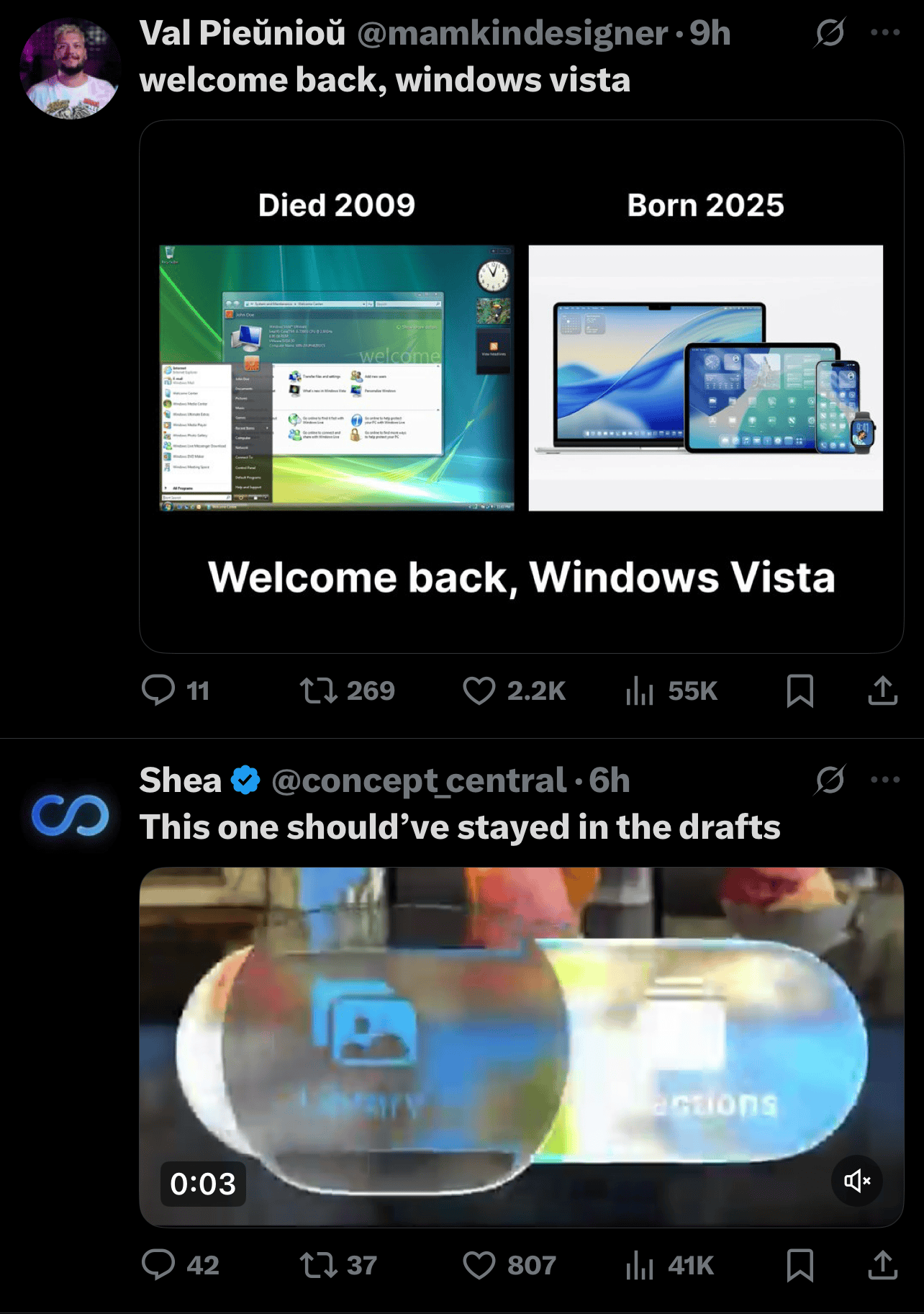
This latest half-baked visual overhaul reeks of desperation. Kicking off the keynote by comparing it to iOS 7's internet crashing debut? Bold, but delusional. The so-called "Liquid Glass" UI is what happens when you chase change just to say you did something. It's not about crafting something users will love; it's about some exec wanting a shiny new toy to wave around.
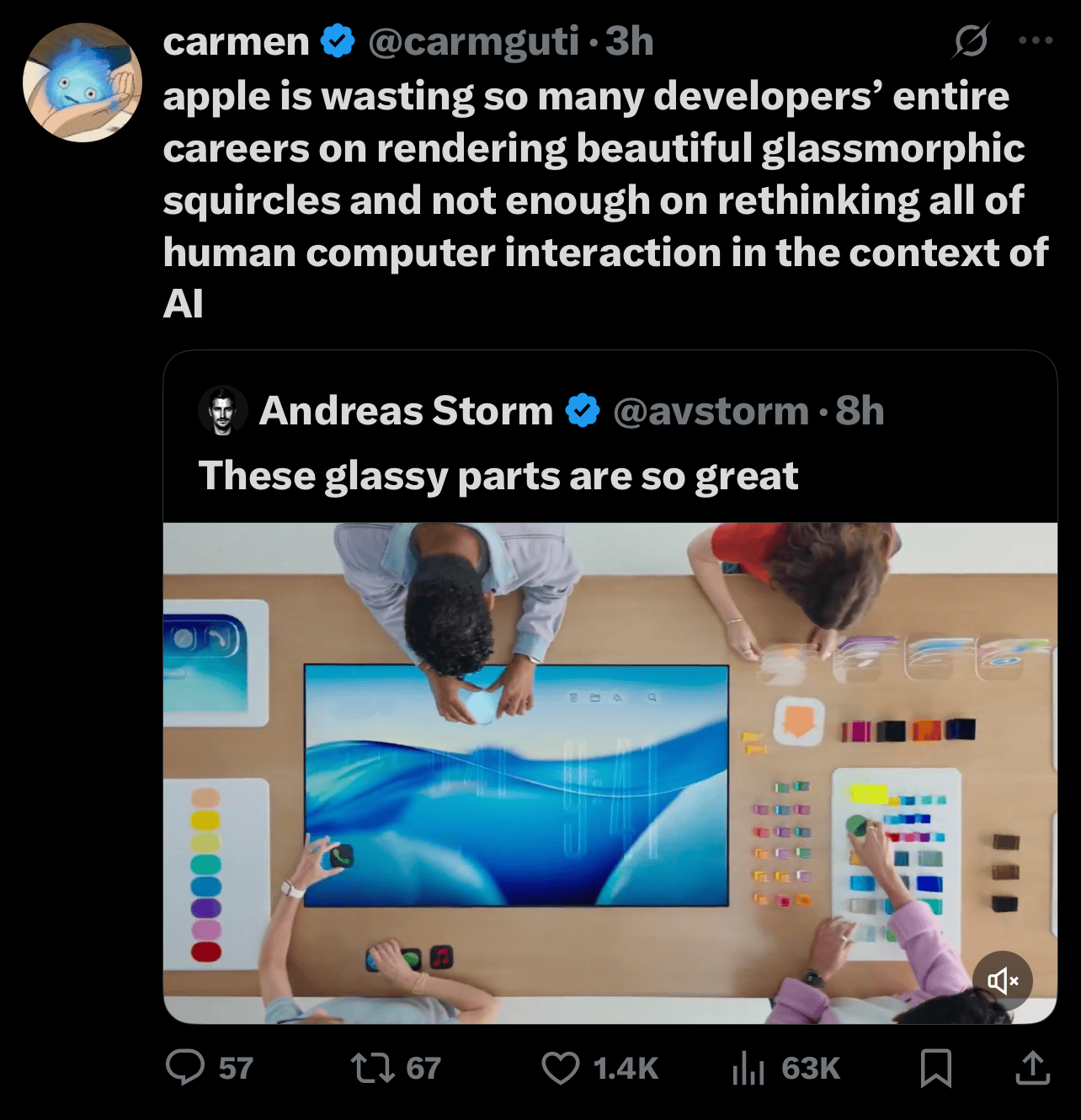
Compare the Liquid Glass demo to iOS 7's, and it's night and day. iOS 7 showed off practical UI in action; Liquid Glass is just close-up shots of random glassy blobs sliding across a table. How does that reflect how anyone uses their iPhone? Spoiler: it doesn't. It's a masterclass in leadership dropping the ball, chasing flash over substance, and ignoring Apple's core mission of building products people actually adore.
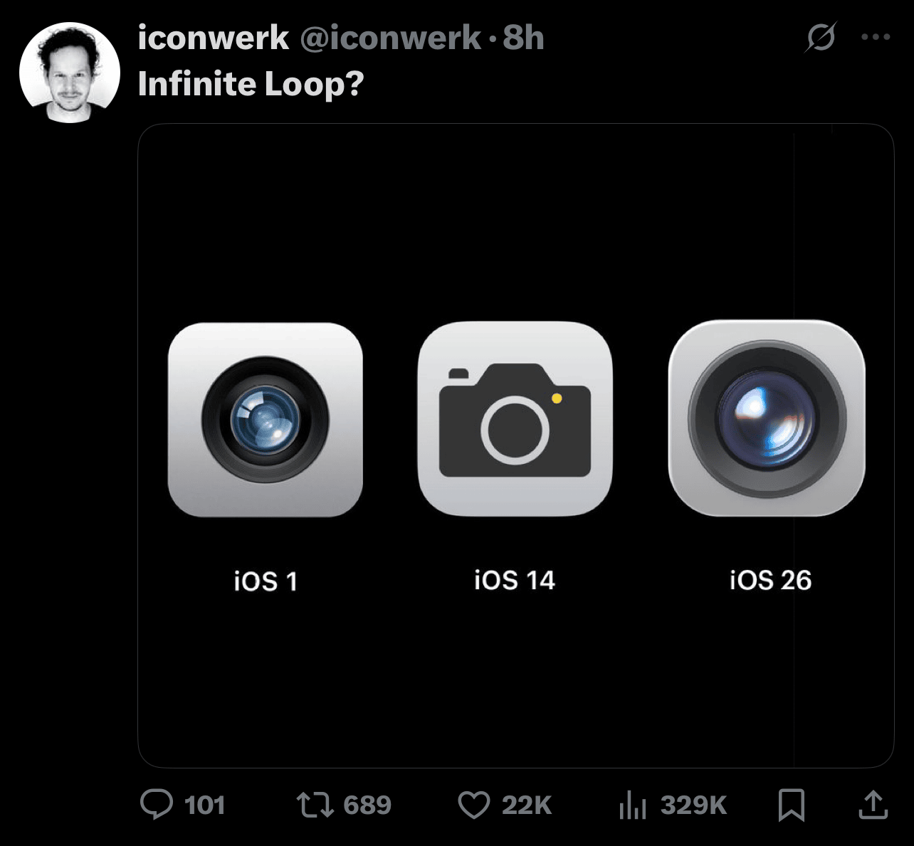
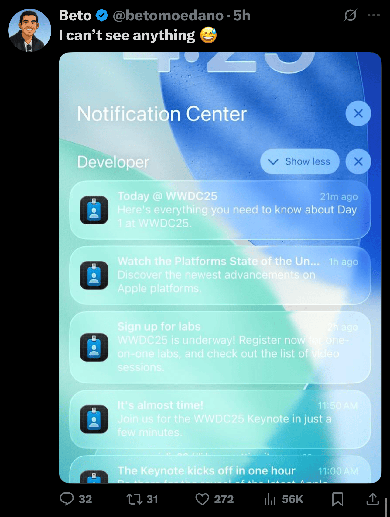
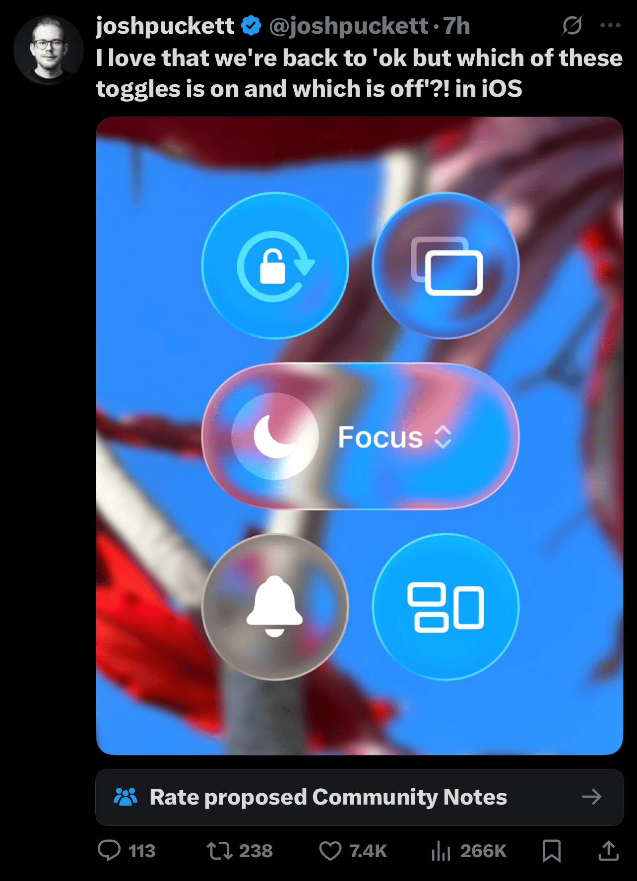
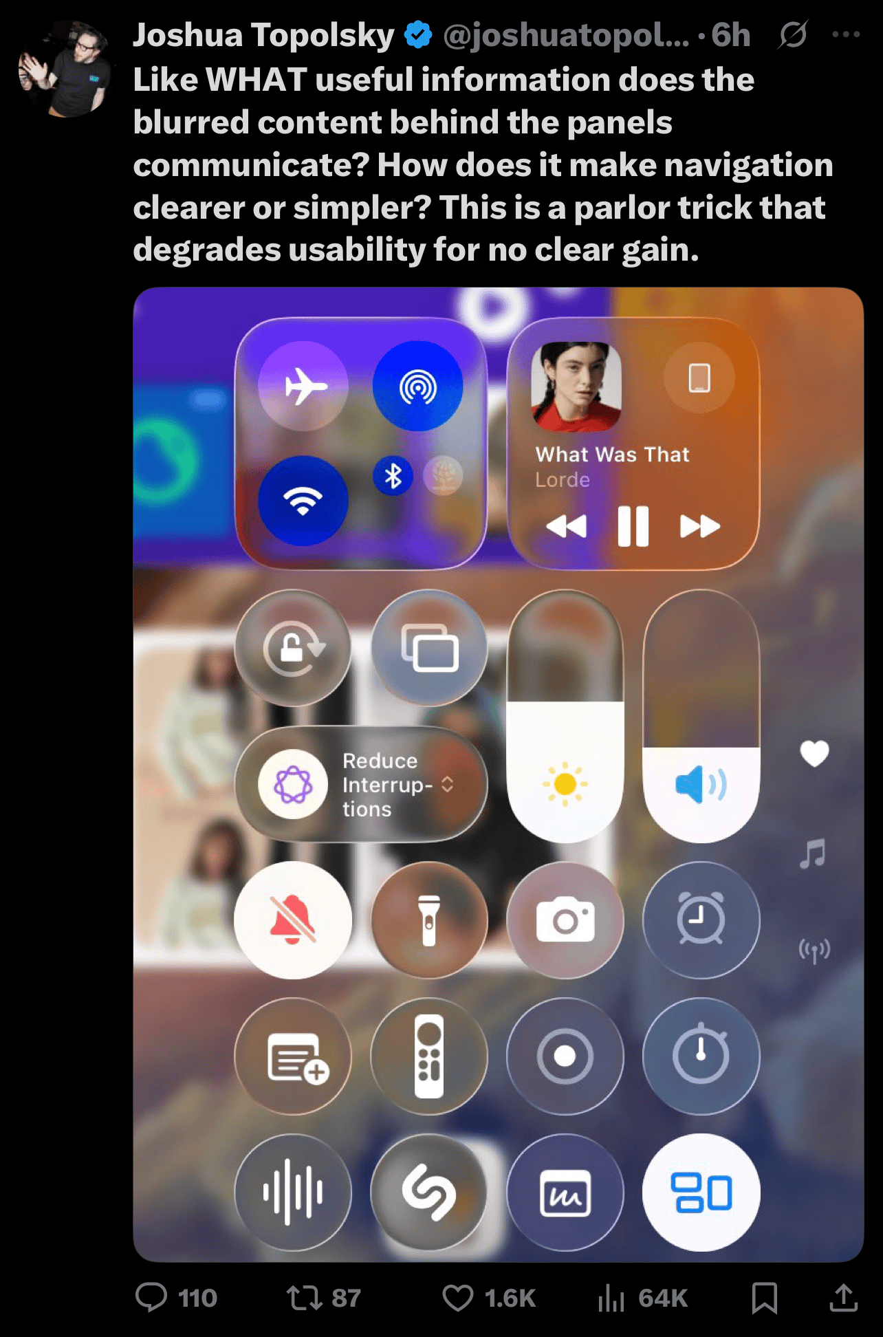
The result? A UI that's lower contrast, harder to navigate (good luck finding the camera app), and distracting as hell. All because some design lead wanted to "leave their mark" and prove the software team isn't a total dumpster fire. Spoiler alert: they proved the opposite.
Maybe it's time for another leadership shake-up. Or better yet, let Apple's insanely talented designers off the leash and stop jerking them around with half-baked directives.
Sorry for the rant. Guess I had a lot to get off my chest.