Question Everything
I did a presentation of this chapter at an avid iOS developer meetup called ViDIA on May 24th, 2018. Below is the video of the presentation. If you'd like to read instead, then scroll on...
I decided to start a series of blog posts called Design Without a Designer in an attempt to share my knowledge and know-how and some tips and tricks that I have picked up along the way with others. And I know what you are thinking right now. Why am I, a designer, talking about design without a designer?
There have been many times when, in my free time, I start working on a fun side-project but when I'm done, I have trouble finding a developer that has enough time to work on it. I also know that many developers work on side-projects where they have trouble finding designers. Knowing the pain, if I can share a bit of information that would help others with their projects and get them moving forward a bit more, then the question should be why wouldn't I write "Designer Without a Designer".
One problem that many professionals, especially in the tech industry, have is that when faced with any idea, we immediately frame it within our knowledge. For example, someone might be explaining to me an app they are working on and I start imagining the interface of the app, the pages it might have, the buttons and the animations between the screens that might be there. A developer might be listening to the same conversation, but they would think about the back-end requirements, the libraries and frameworks that might be needed, and how much of it can be made with native elements.
Thinking within the frame of our knowledge is a trick that our brains have learnt through evolution to save processing power. There's simply too much to process and we use tricks like pattern recognition to have a more efficient thinking process so that we can survive more. But in areas like tech, being stuck in the pattern recognition mode is not a good thing. In tech, you want to go a step beyond and find the truly innovative and disruptive ideas.
Let me show you with an example. I picked the simplest app idea I could think of: an alarm clock app.
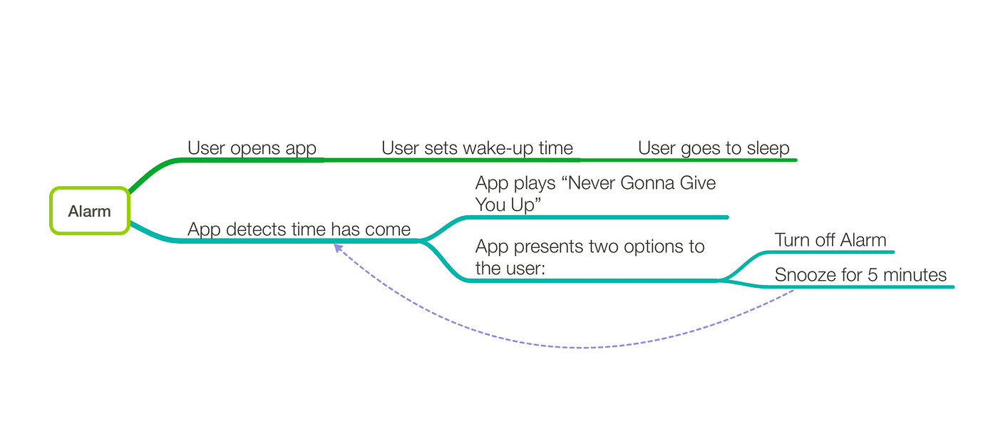
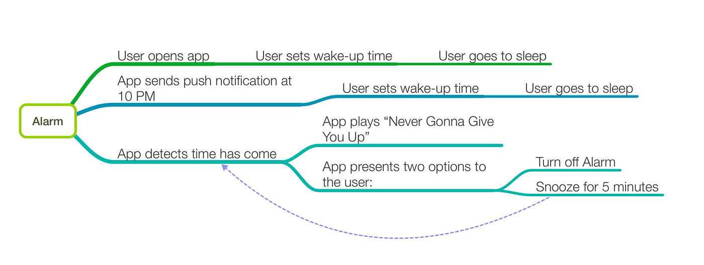
The first thing I like to do with every project I'm working on is to get a full understanding of all of the features and functions by creating a mind map. A mind map for an alarm clock would look something like this: User opens app, sets wake-up time, and goes to sleep. The app then detects when the set time has come, plays "Never Gonna Give You Up", and presents the user with two options: turn off, and snooze. Snooze would send the app in a 5-minute loop until the user hits stop. Very straightforward.
At this point, as a designer, I might start thinking about the screen where you set the alarm. Is it a regular time-picker or should there be a fancy slider that you can use to set the time. The snooze/off buttons; what are they going to look like. And a developer might start thinking about how the time is going to be stored, or what frameworks are needed, or what native features of iOS and Android might help make this app easier.
But that is the problem. We are thinking in the frame of our own knowledge and we need to step beyond it. Instead of thinking: "What can I build with what I know?" we should be thinking: "Let's dream what this can be, and figure out a way to make it!"
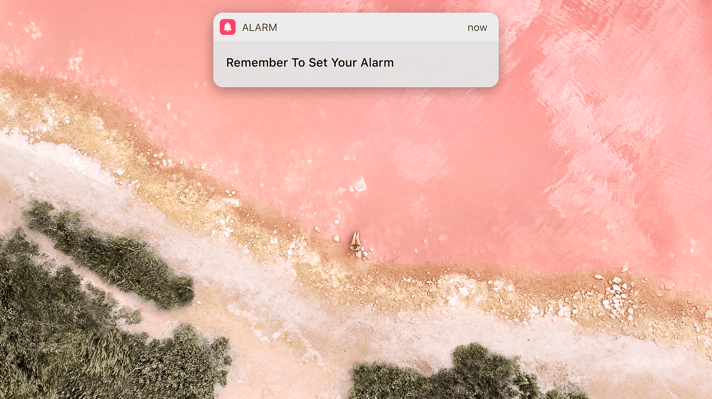
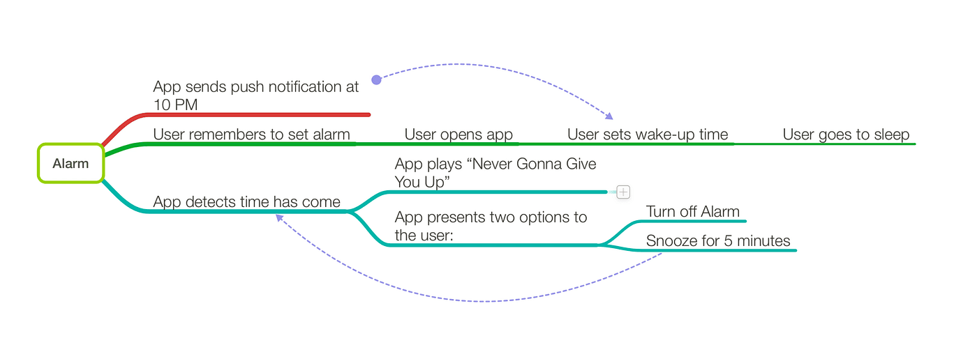
The easiest way would be to pick any step in the mind map, and ask yourself this simple question: "Can I still make this idea work, if I remove this step from the process?" Well, let's have a look. Removing the "User opens app" step might at first seem crazy. But let's see what other options we have. Maybe we can take advantage of the notification system?
Well, here's the updated mind map. There is now a new path the user takes to set the alarm. It looks like we have made things more complicated but at least now the user has an option. It doesn't feel like a major improvement. But if you really think about it, the mind map should look something like this now:
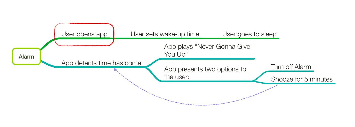
Without the notification, the user had to remember to set their alarm every night. That is a big task to ask of our easily distracted monkey brains. We forget things all the time. But with the notification system, the user no longer needs to remember! We have removed the burden of remembering something from the user and that's fantastic. Every time you can remove a step your users need to take to accomplish the same results, do it! Human beings are lazy, and we like it when things are done for us. Now we know that we are moving in the right direction, so let's keep on going. We have a notification, what else can we do with it?
Maybe we can look into the user's past behavior, and see that 90% of the time the user chose 8:00 or 8:30 as their alarm. So we can present those options as default ones right away. That's another interaction the user no longer needs to have. Great! We're on fire, let's keep going.
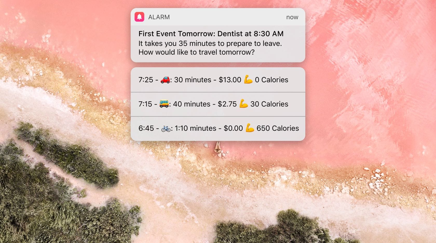
Maybe we can look into the user's calendar and see that they have a dentist appointment tomorrow morning. We can give the user two options based on how long they would take to prepare.
Let's take a look at how this compares to what we started with. Initially the user had to check their calendar to see when the dentist appointment was. Then they'd have to check Google Maps for driving directions and time, and think about how long they take each morning to prepare. Then do the math and work their way back from the 8:30 appointment, 35 minutes drive, and 30 minutes preparation time. Now, all of that is already done and prepared for them. A highly contextual and personal experience. Let's keep going.
Maybe the user always takes 30 minutes to prepare. And instead of showing different preparation times, we can show different modes of transport. Showing different modes of transport rather changes the nature of the notification though. Biking is obviously the better choice for the user. What if we take advantage of that and add some encouragement for the user?
Maybe we can show how much each option would cost. We're not saying that the user should bike there, we're just pointing out how much each option costs. Be careful to not assume and say things that might offend people.
Maybe we can also show how many calories each of those options would use. Very neutral, yet informative and caring.
The ideas can always be taken to the next level. Especially if you have a group of people and an environment that encourages out of the box thinking and new ideas. Simply by asking that one simple question, can we have an app where the user doesn't open the app, we have transformed our alarm from a regular boring one, to one that really cares about you.
If there is one thing I want you to remember from this article, it would be this: Question Everything! Because it's when you question the mundane, the boring, and the usual, that you break the boundaries of what's normal and you come up with creative, genuine, and disruptive solutions.
Logo Design Basics
You go on Instagram and you see a bunch of really clever logos, then you think to yourself: "My business needs a clever logo like those!" Alright. Let's see what it takes to create one of those clever logos for your business.

Let's have a look at the logo above. What do you see? A guitar, a match, and flames. If you were to guess what the company name is, what would you guess? Flame Guitars or Guitar Match or something like that. And you'd be right. The company is called Music Match. The logo is definitely clever and eye-catching, but would this logo be right for your business?
To answer that, we need to first establish what makes a good logo.
A good logo needs to accomplish these 4 things:
- Grab people's attention
- Provoke an emotional response
- Have meaning
- Be memorable
Let's break them down.
1: Grab People's Attention
It's a busy world out there. If your logo doesn't grab attention, it's dead before it has a chance to convey anything.

That's why the first thing your logo needs to do is grab attention. Who cares how clever it is if no one notices it? So how do you grab attention? Luckily, there are a few tricks that you can use to grab people's attention.
Evolution
Evolution has taught us to pay attention to very specific things. Colorful shapes with high contrast usually mean ripe fruits and nutrition. Using those in your logo is a sure way of getting attention.
Another thing we are evolved to pay attention to is faces. We can see faces in dimly lit rooms easily and we can even tell someone's looking at us when they are on the edges of our peripheral vision. Isn't that crazy? Imagine a logo being able to get your attention even when you're not looking at it.
We happen to also pay a lot of attention to provocative shapes. Mating is heavily rooted in our brains and noticing certain shapes is almost unavoidable.
Your logo has split seconds to grab attention. If it takes any longer, then it's not working right. What we're trying to do here is to trick the deep lizard brain inside people to get their attention. Evolution has taught us a few tricks and that's the reason it only takes a split second to grab people's attention.
2: Provoke an Emotional Response
The next thing a logo needs to do is evoke an emotion. Are we friends or foes? Am I going to attack you or befriend you? This takes about a second to decide. This emotional response is also unconscious and happens mostly automatically without any active thinking.

It's very important to align your corporate identity with the emotional response you are evoking in your audience. If you have a serious corporation that focuses on security and encryption, then use a very aggressive tone. If you are a friendly local farmer's market, then use a very friendly tone.

Aggressive elements:
- Vertical lines
- Asymmetry
- Sharp edges
- Triangles
Friendly elements:
- Horizontal lines
- Symmetry
- Rounded edges
- Circles
Neutral elements:
- Squares
- Most texts
One example of what not to do: HP decided to do a re-branding a couple of years ago. They are a consumer electronics company and their logo would be something that's very close to their users. They see it every time they open their laptops. And this is what they landed on:
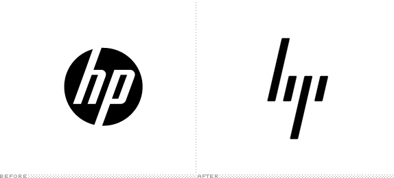
The old logo on the left was in a circle. Very friendly. Had mostly vertical lines, but some horizontal ones too. Balanced. It worked great. The new HP logo on the right removed the circle, removed all horizontal lines. It is completely asymmetrical. Only made of vertical lines. Has sharp edges. It is literally impossible to create a more aggressive logo than this (except for death metal logos). Unless HP now wants their customers to be scared of their laptops, this re-design is a complete failure. At least in the emotional response step.
3: Have Meaning
This one's a bit difficult. In some cases like MusicMatch, you have words in the title of the company that have physical representations. There are, however, many other words that do not have any representations like quality, luxury, trust, etc.
Incorporating meaning into the logo could also prove difficult at a later stage because you have to plan for it from the beginning. Otherwise, it would feel forced and out of place.
One thing you can do to help make things easier is to find any icons or symbols that would align with the company's mission statement or product in any way. From here you can start to mix and match different elements of the icons with each other to see if something comes of it.
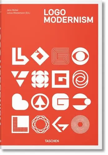
If you need help with coming up with ideas and you just can't wrap your head around combining ideas like that, fear not. There is a book. A magical book. That I often use myself for inspiration. It is called Logo Modernism. To be honest, at this point I don't even know how I ever did any logos before finding that book. It's perfect for when you're having a creative block or if you're not the creative type at all! I'm not sponsored by anyone to endorse this book. It's just really amazing! I don't often recommend products, but this book is definitely one I would recommend.
Once you find a logo that somehow represents what you like, either from the book or from your sketches, then you can start working on it in an app like Sketch. Sketch is perfect for creating vector shapes like these, even for beginners.
After you nail the general shape, then you have to think of colors. There are a few guides to follow when choosing a color for your logo. It's about finding the right balance between what color looks good and what color puts the right message out there for your company.
4: Be Memorable
The last thing a logo needs to do is to be memorable. All of this would be for nothing if the next time your customer sees your logo they don't remember you. Lucky for us, there are a few tricks we can use here to make the logo as memorable as possible.
Here's some bad news. If you are just starting out your business, it might be a good idea to add items to your logo to increase its connection to your company and help with memorability. That might make the logo less appealing to you because it won't be as simple, but keep in mind it's just temporary. Here is a good example:
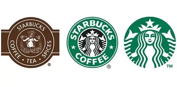
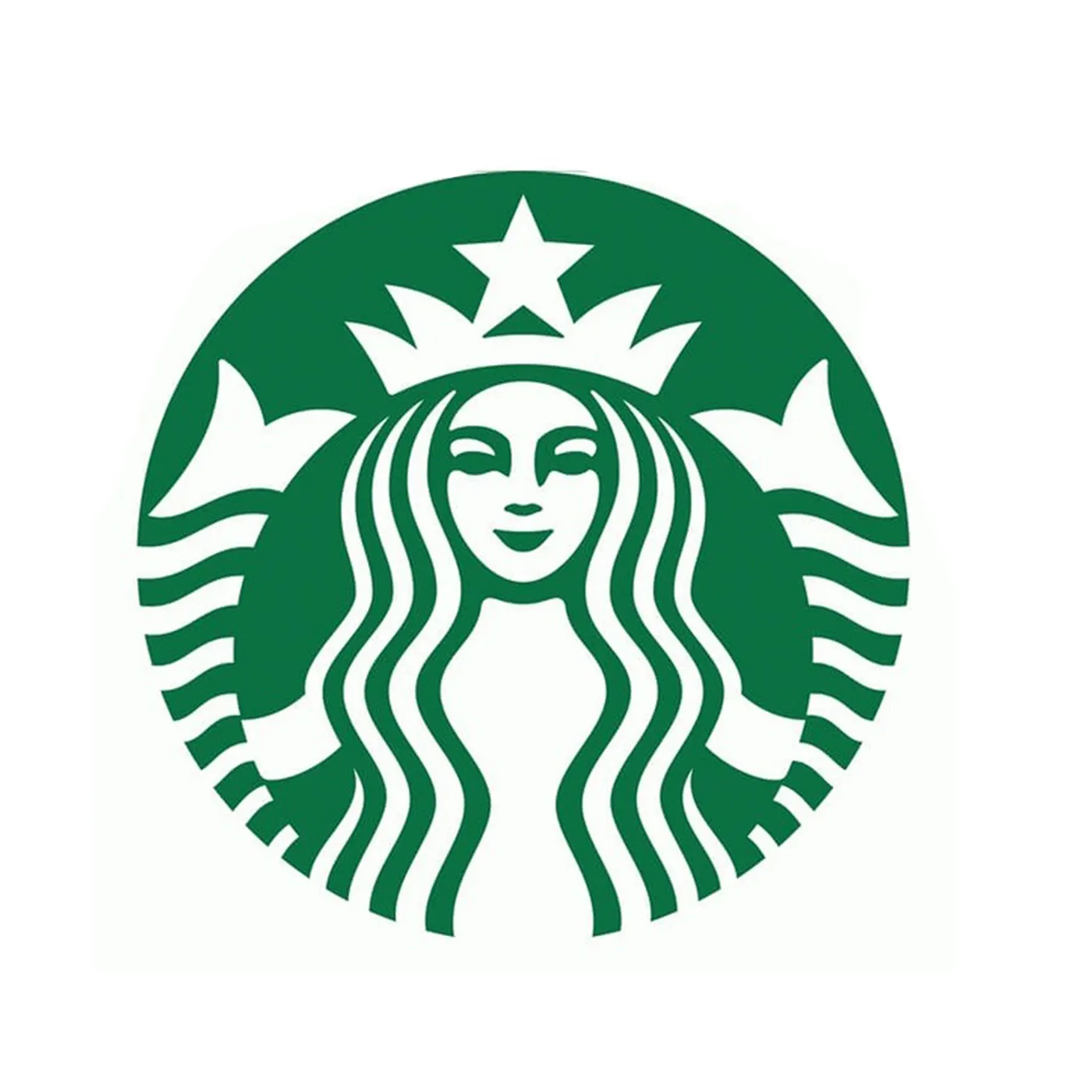
Starbucks has only recently dropped the words "Starbucks" and "Coffee" from its logo. It's only when a company is at their level of recognition that they can get away with this. If a smaller local coffee shop decides to drop their name from the logo, it would have a severe negative impact because nobody would recognize it anymore. So if there are things that you need to add to your logo to help with recognition, it's ok. If Starbucks got away with it, you can too.
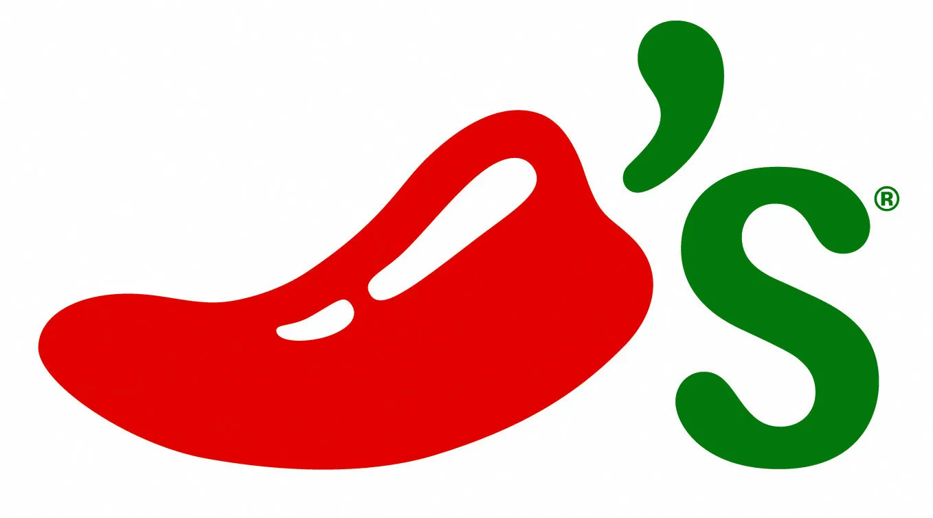
So how can you increase recognition of your logo? You can spell out your name like Starbucks did. Or you can use the initials of your company. If there is an icon that represents a word in your company name, it's a very good idea to use it in the logo. A good example would be Chili's.
Logo Design Tutorial
In the previous chapter, we went through some of the basics of logo design. In this chapter, we get a bit more serious. Starting with a tutorial. If you have ever opened the Sketch app, then you should be ok following along with the tutorial:
This tutorial is meant to give you the skills necessary to start turning your logos from sketches into Sketch files. Let me know in the comments if there are any logos that you'd want me to create. You can send me photos of what you've drawn so far if you want help with turning them into Sketch files as well.
If you are working on a logo design for your own company and are already set on an idea, then that's great. You can play around with it on paper and take a couple and turn them into vector drawings in Sketch and see how you feel about them. But if you are creating logos for a client that is not fixed yet on an idea, then you might be going through a lot of iterations before settling on a few favorite ones. Here I show the process of iterating logos for my last client. We went through more than 200 logos before settling on one that the majority of the team really liked.
If you learn to be quick in Sketch, this can actually be a really fun process! I have to admit that after a week I could feel the mental toll, but in the end, it was well worth it!
I have a few ideas for what to include in the upcoming chapters for this series, but if there's something specific that you'd like to learn, please let me know. Remember, information is best shared!