I will not be getting into the history of the shift key and how Apple has tried to get it right over and over again, failing each time in one place or the other. To get a detailed history and for an amazing read, check out this article.
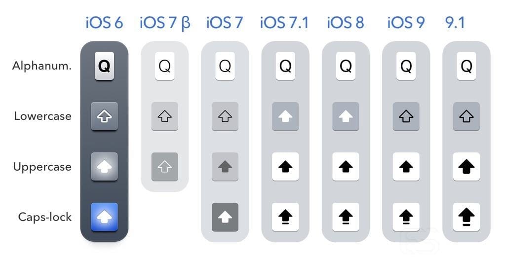
With the introduction of iOS 9, Apple started showing lowercase letters when the shift key wasn't active.
This approach has solved one problem for the user: knowing whether or not the shift key was pressed. Simply by looking at the keyboard and the letters the user would be pressing, they'd know whether they were inputting the uppercase or the lowercase letter. The user no longer needed to remember the states of the shift button.
The problem with this approach is that by solving one problem, Apple has introduced a new one. Switching between uppercase and lowercase letters increases the cognitive load required to operate the keyboard. In simple terms, the user needs to remember more to operate the keyboard as efficiently as they've done before. There are three ways a user can find a button on a keyboard:
1: (Beginner) They scan the whole keyboard looking for the letter.
2: (Intermediate) They have memorized the area that button is in and they can find it quickly.
3: (Pro) They have memorized where exactly that button is.
And here are the reasons why the new approach doesn't work well:
1: Before, when all the letters were uppercase at all times, the user had to find 1 shape from 26. But now with the introduction of lowercase buttons, the user needs to find one of the 2 forms of the letter from 52 possible shapes. So for beginner users, this approach is a nightmare!
2: Users who know roughly where to find a button usually do so by looking at the neighboring buttons. For example, "I" is above "J" and "K." That mental model has been created over time by using physical keyboards (that are always uppercase) and by using previous versions of iOS. But now, because of the introduction of the lowercase buttons, the user needs to add new information to their mental model: "i" is above "j" and "k." By simply adding lowercase letters, Apple has almost doubled the amount of information an intermediate user needs to remember to use the keyboard efficiently.
3: Pro users who have the full keyboard layout memorized aren't affected by this change much. In the beginning, the switching between letters on the keyboard is a bit shocking, but with a bit of getting used to they can be back on track in no time.
The advantage of the lowercase buttons is to inform the user of the shift button's state. The disadvantages are slowing down non-pro users' typing speed. But is the sacrifice worth it?
Wouldn't a shift button that's very clear when it's active have been a better solution to this problem?

Here's my proposed solution: removing the lowercase buttons and designing a shift button that's REALLY clear about its state.
Let's not forget about the caps lock either. Although in almost every stage of the shift button's life the caps lock has been the clearest one (with underlines and glowing blue lights before that), it has contributed to the confusion by being an extension of the shift state and making it impossible to design a binary state for the button.
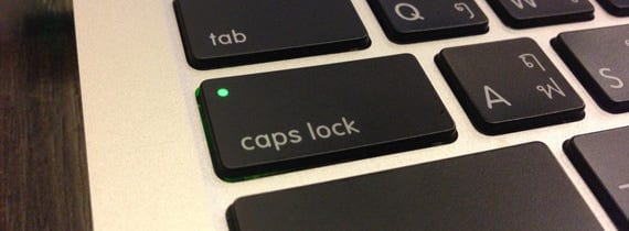
There's already a universal solution for caps lock: the green light. Everyone knows that when it's on, caps lock is active. So why not simply use this universally known light on the shift button, and then we can only worry about the on/off state of the shift button?

Inactive shift button. Thin outline and gray fill.

Shift Active. White fill. White glow. Thick outline.
There should be no mistaking that the shift key is on. I made the stroke thicker, added a white fill, and just to be sure, added a slight white glow to it as well. The user only sees one state at a time so they should be able to tell whether a button is on or off by simply looking at one of the images above.
Last but not least, the caps lock. A circle on the top left of the button with the same white glow and fill indicates a very obvious caps lock state. And just to be sure, I added the underline as well.