CoreStory
Overview
Fun Fact!
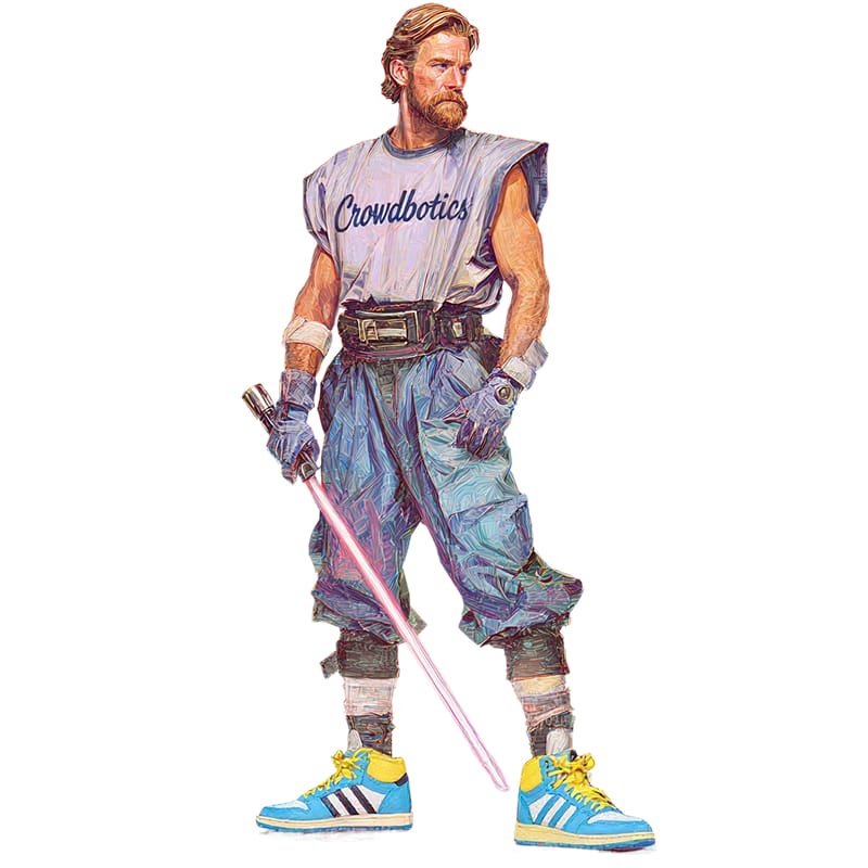
The internal code name for CoreStory was "Kenobi". A nod to the Jedi Master known for bringing clarity to complex situations.
Click anywhere to close
The internal code name for CoreStory was "Kenobi". A nod to the Jedi Master known for bringing clarity to complex situations.
Click anywhere to close
The Team
Click anywhere to close
Designer
CPO
PM
Front-end Developer
Backend Developers x2
Click anywhere to close
My Responsibilities
Click anywhere to close
End-to-end product design ownership
User research & synthesis
Designing AI trust & transparency patterns
Design system creation
Interactive prototyping & validation
Prompt design collaboration
Cross-functional collaboration
Click anywhere to close
7 months. No handoffs. Everything in parallel.
Click anywhere to close
Feb
Mar
Apr
May
Jun
Jul
Aug
Sep
Research
Concept Exploration
Prototyping
Internal User Testing
Design System
External User Testing
Implementation
Click anywhere to close
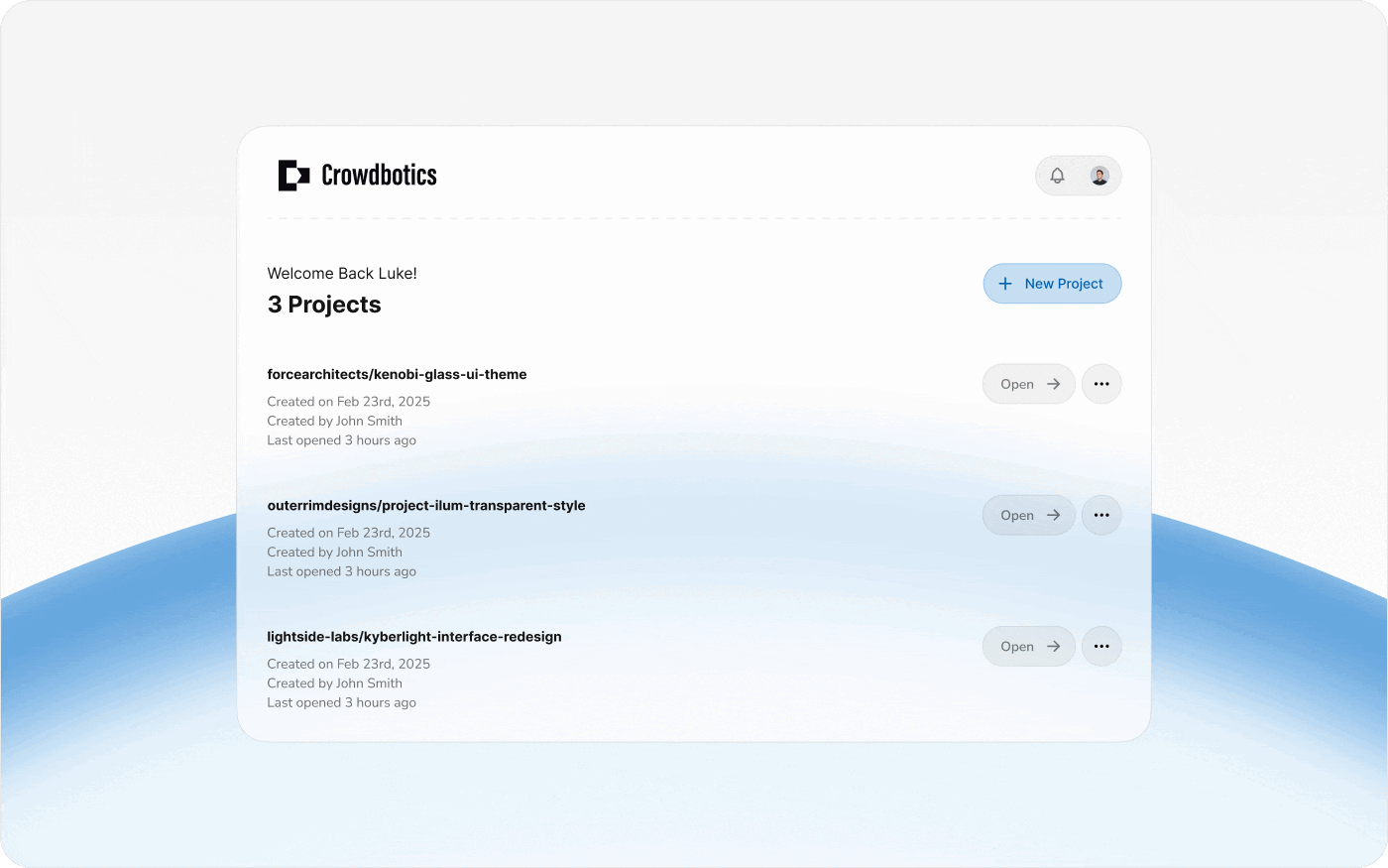
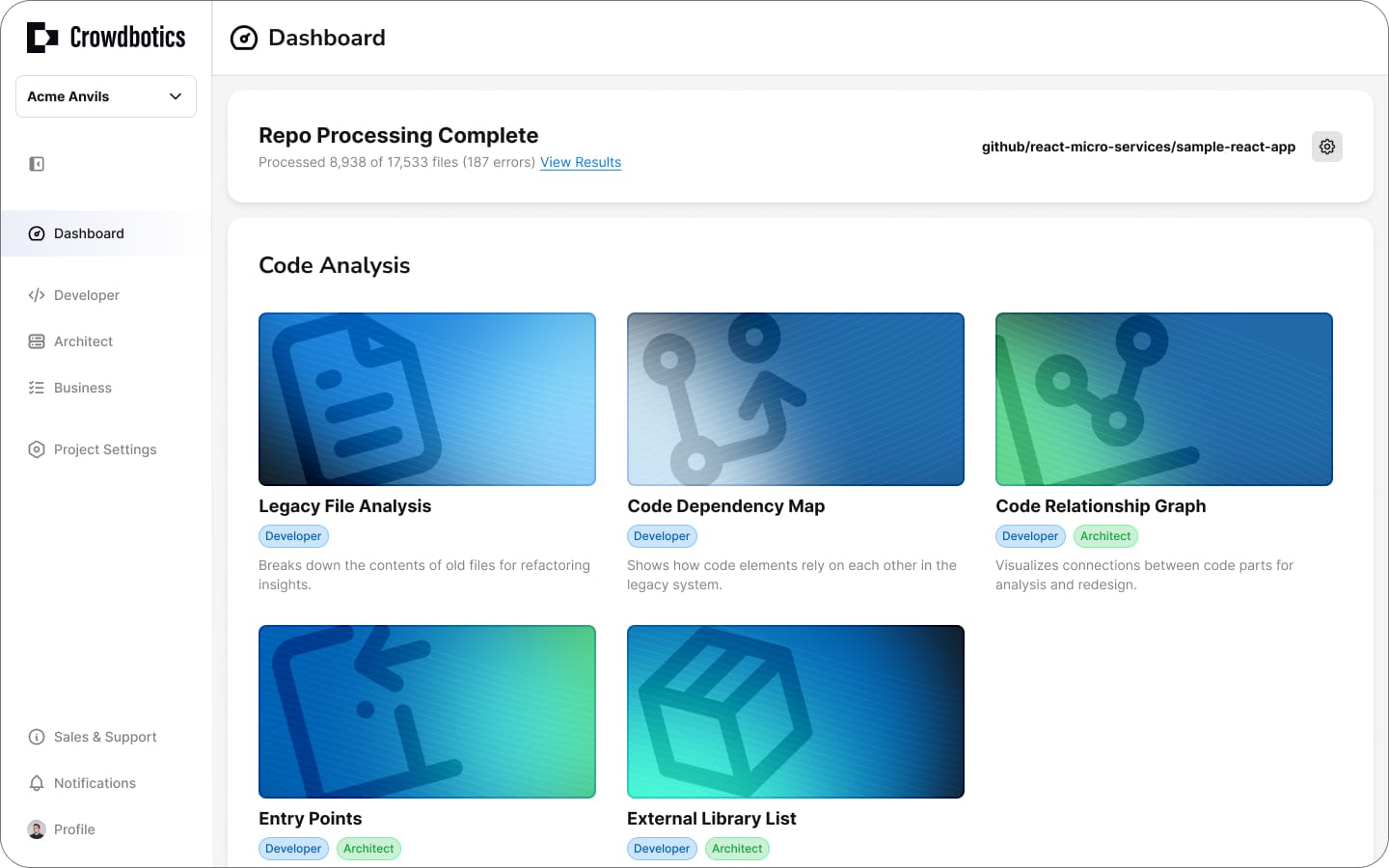
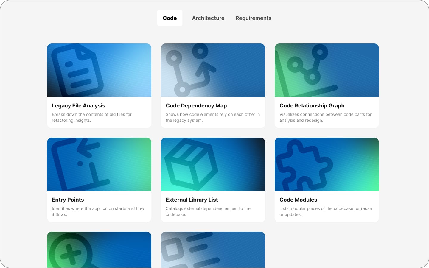
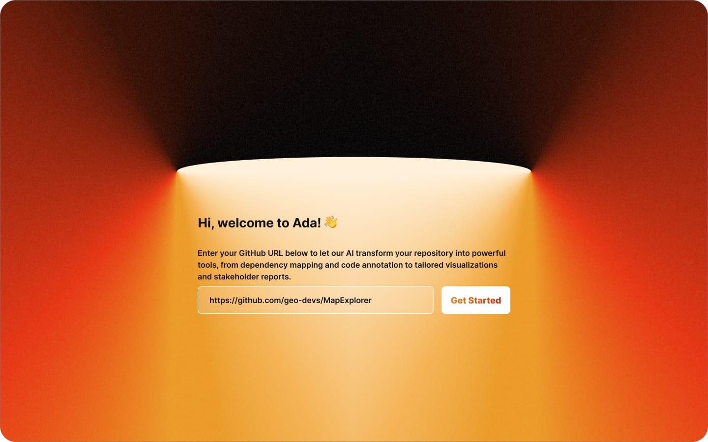
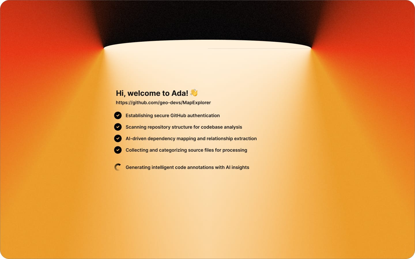
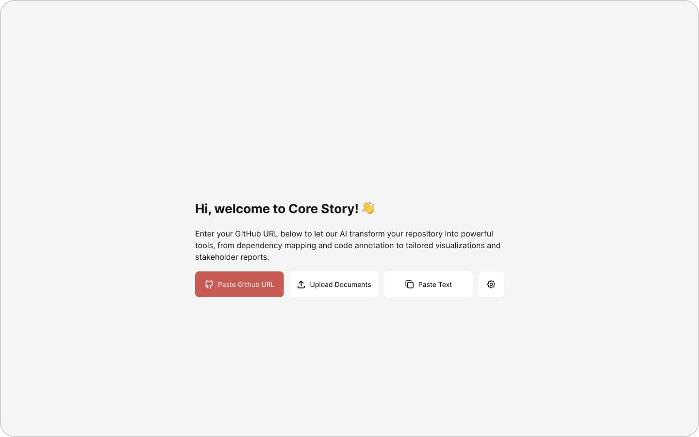
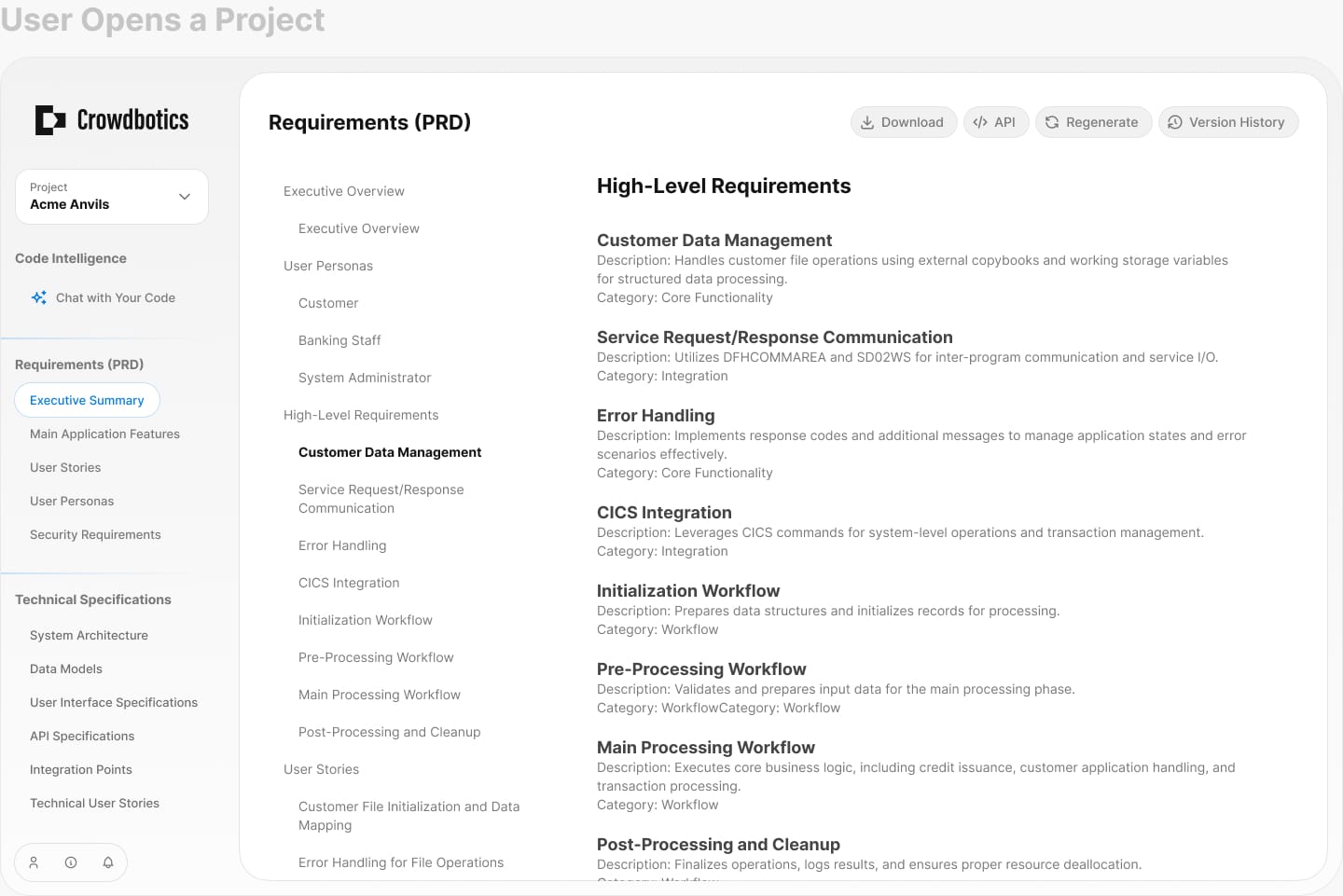
CoreStory helps companies understand and modernize legacy codebases that nobody fully understands anymore. It generates artifacts and insights for developers and architects.
These codebases are too large and complex for generic AI tools or manual analysis alone, so CoreStory was built to handle what neither could.
The product came out of a major pivot at Crowdbotics and became the company's entire focus.
These codebases are too large and complex for generic AI tools or manual analysis alone, so CoreStory was built to handle what neither could.
The product came out of a major pivot at Crowdbotics and became the company's entire focus.
Click to learn more
Role
Senior Product Designer (only designer on project)
Click to learn more
Timeline
February – September 2025
Click to learn more
Team
Cross-functional (Engineering, AI/ML, Product)
Scope
Enterprise B2B SaaS - Web Application
Scope of The Project

Enterprise clients had massive systems built decades ago by people who no longer work there. Written in legacy languages like COBOL, FORTRAN, and early C++, these codebases have become black boxes. Modernization projects stalled because nobody could answer: "What does this system actually do?"
Companies were spending €50,000–80,000 rehiring retired developers just to interpret their own code. Delaying projects by months.
Companies were spending €50,000–80,000 rehiring retired developers just to interpret their own code. Delaying projects by months.
Why companies urgently need to modernize:
Unfixable Bugs
Bugs that nobody fully understands. Every fix risks breaking something else, so they just... stay.
Customer Churn
The system is slow, features are missing, and customers are leaving. But nobody can update anything without understanding it first.
Monolithic Architecture
Everything is connected to everything. You can't change one thing without risking the rest. Scaling or updating independently isn't an option.
Compliance Risk
These systems were built before HIPAA, GDPR, and Basel III existed. Now they need to comply with regulations they were never designed for.
Personas
Developers
Understand what the code actually does, how complex it is, and where the problems are.
Architects
See how the system is structured, what depends on what, and where the architecture is fragile.
Business Stakeholders
Know what the system does in business terms, where the compliance gaps are, and where to focus resources.
Phase 1: Research & Discovery
Methodology
18 Interviews
Discovery interviews with architects, developers, and technical leads
30-45 min
Per session, one-on-one
4 Industries
Infrastructure, finance, healthcare, industrial automation
12-25 Years
Age of the legacy codebases being managed
At the start of this project I became the sole designer at the company. Other teams were waiting on designs and direction, so I had to find ways to move through the research and discovery phase fast without cutting corners. I used AI to transcribe and synthesize interview findings in real-time, spending just 10 minutes per call to extract structured insights while maintaining accuracy and depth.

Insights
The Retiree Problem
Companies were paying €50–80K to rehire retired developers just to interpret their own legacy code. This pain point shaped the product's primary goal.
Knowledge Locked in Code
No documentation, cryptic comments, and systems understood by only 1–2 people who had since left. Tribal knowledge was the norm.
High-Stakes Errors
Miscategorized features caused real damage. One example: "patient consent" filed under "user settings" instead of "compliance" led to a failed audit and days of rework.
Existing Tools Fell Short
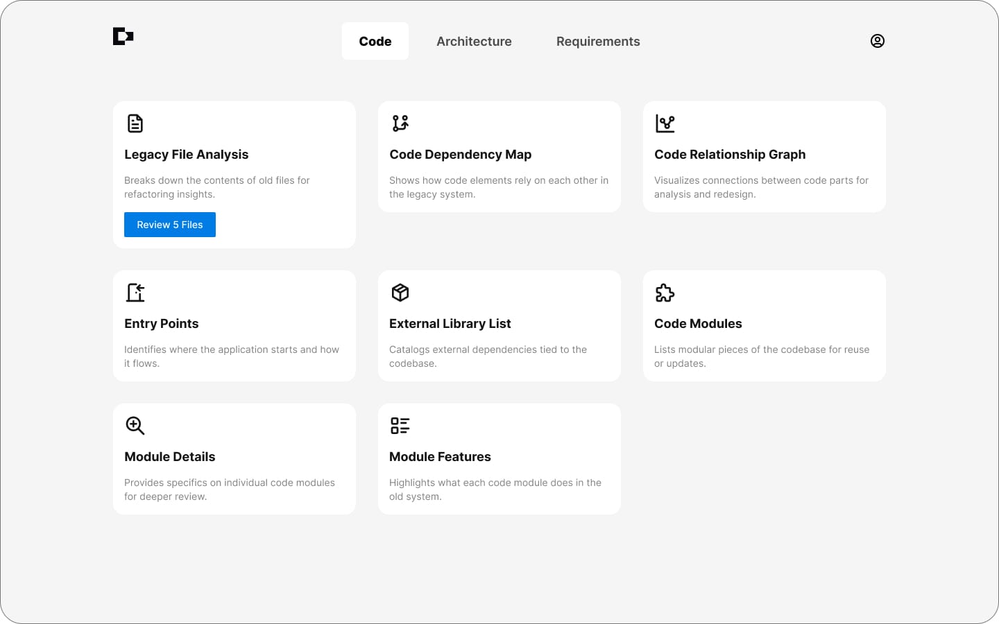
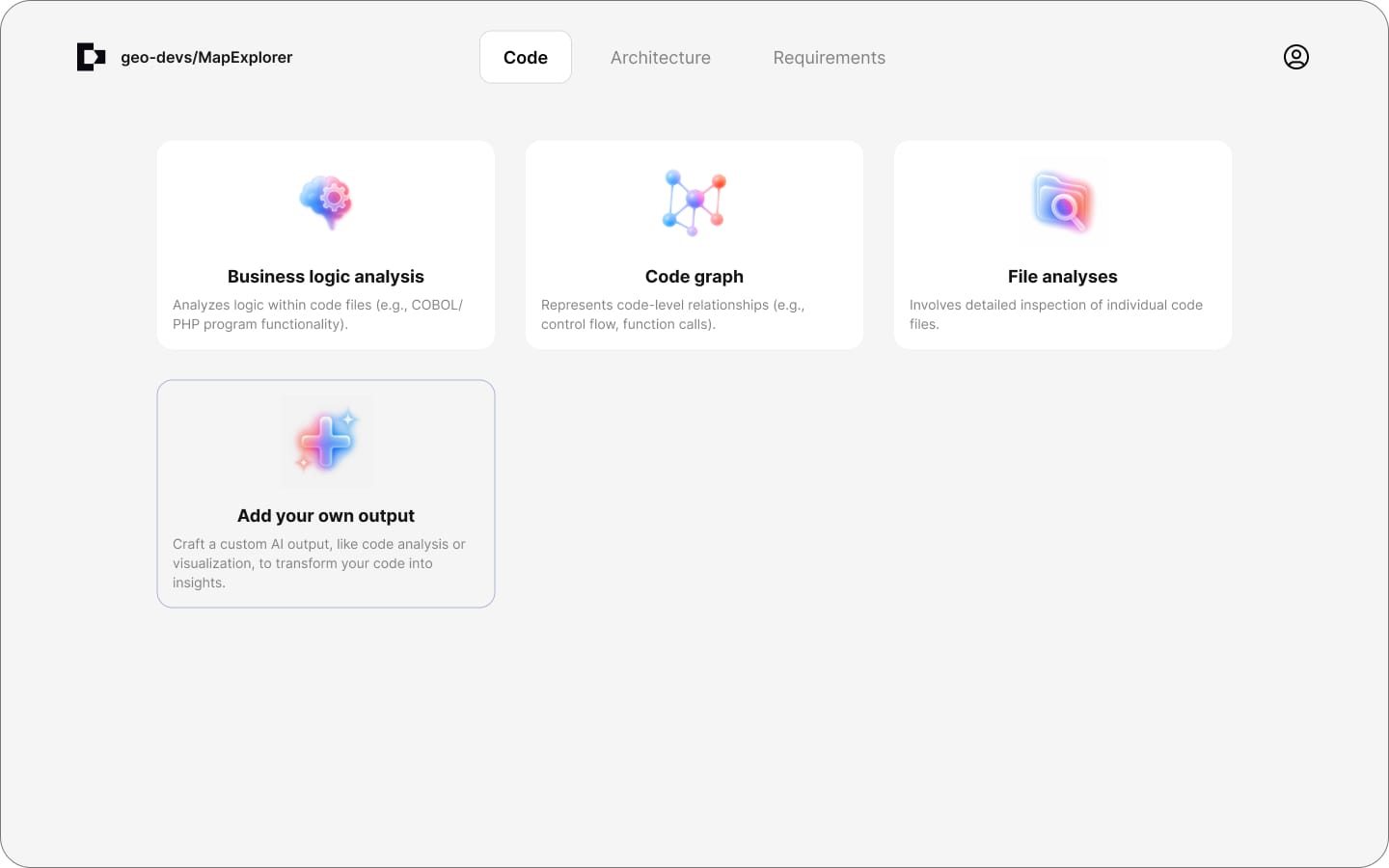
Existing tools could show you what the code looked like, but not what it meant. Nobody could ask "what does this actually do?" and get a real answer.
Mapping the AI Workflow
Users wanted to change the prompt for each artifact, so I needed to understand how each one was actually created. I put together a diagram to map out the full AI workflow. Looking back, the fact that customers were asking to tweak prompts was an early sign of a bigger problem. They didn't really trust the AI output. We'd dig into that in Phase 3.

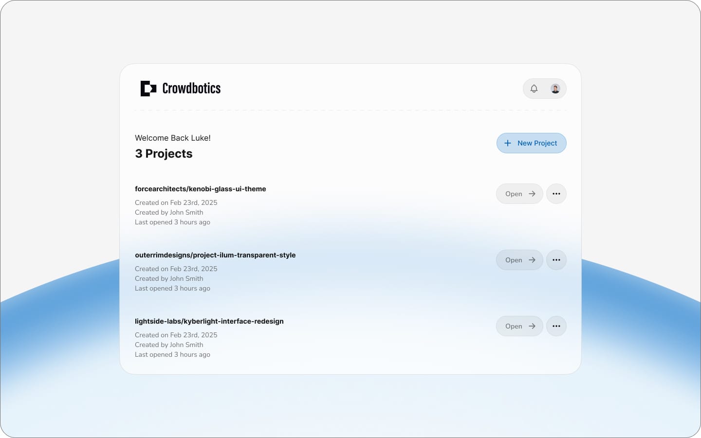
Phase 2: Concept Exploration
Navigation Patterns
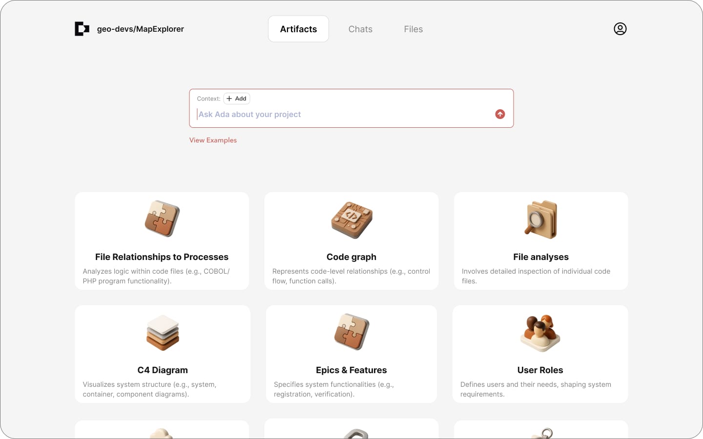
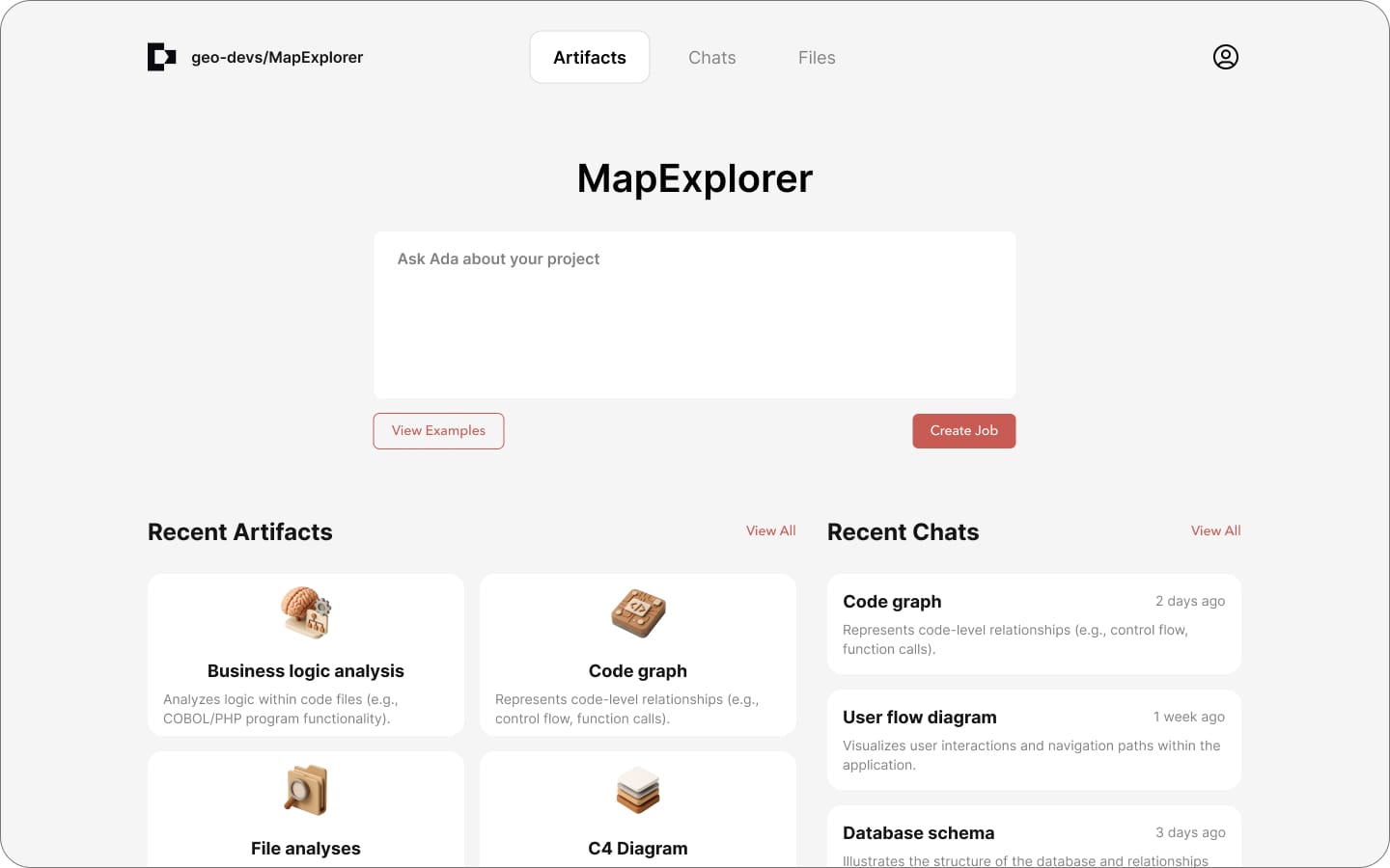
The very first version was based on the old Crowdbotics platform. We simply replaced the old content with CoreStory content. The second version took a more modern, minimal approach. We soon realized we needed to highlight chat as the primary interaction method, and after a bit of testing settled on the left nav as the primary navigation pattern instead of a grid, due to its accessibility and multi-functionality.
Landing Experience
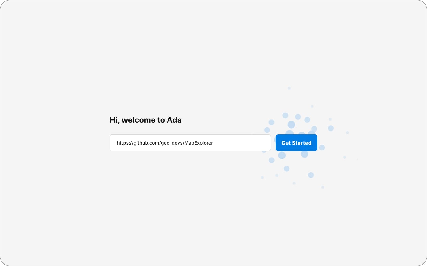
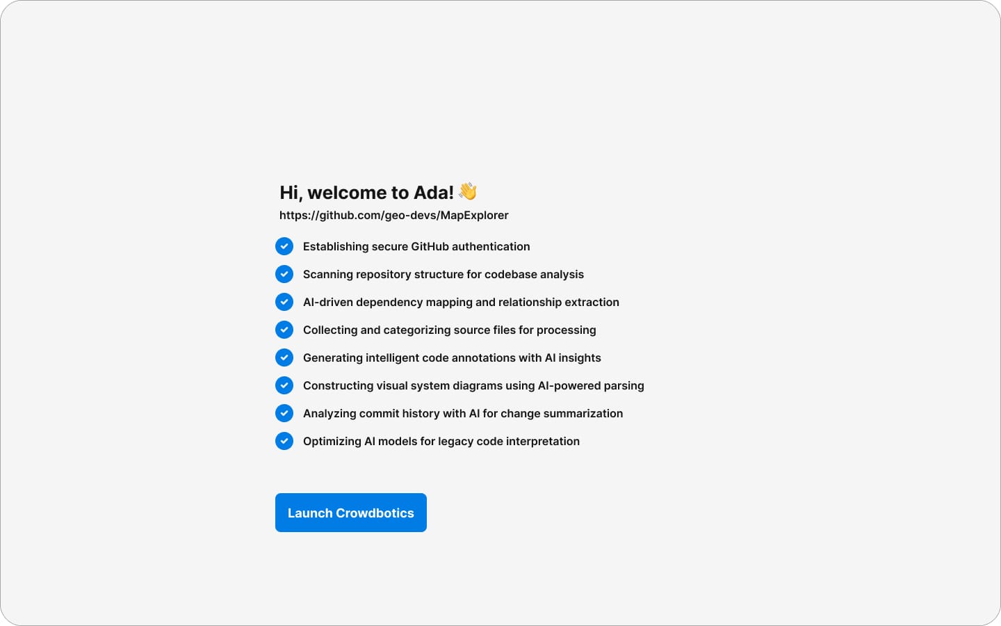
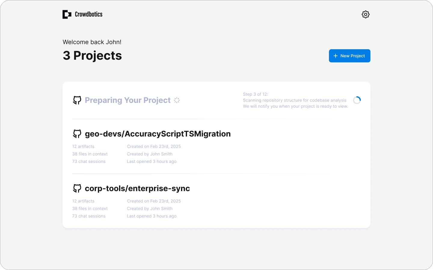
This page was all about feel. We explored a lot of concepts quickly, sometimes going a bit overboard just to see what would stick. After rapid iteration we settled on a subtle glass effect that felt polished without being distracting.
Collaboration & Cadence
The timeline was tight, so I maintained a rapid design cadence, delivering work for review three to four times a week. Deliverables ranged from small refinements to entirely new features, and when we needed fast validation, I turned key designs into clickable prototypes and tested them internally with teams like sales.
Phase 3: Solving the AI Trust Gap
We discovered the trust gap late. In early testing, developers praised how everything looked but hesitated to actually use the outputs. Further questioning revealed the cause: bad experiences with other AI tools and constant news about hallucination had created deep skepticism. If customers didn't trust what the platform produced, the project was dead in the water. We had to solve this fast.
Step 1: Displaying Confidence Levels
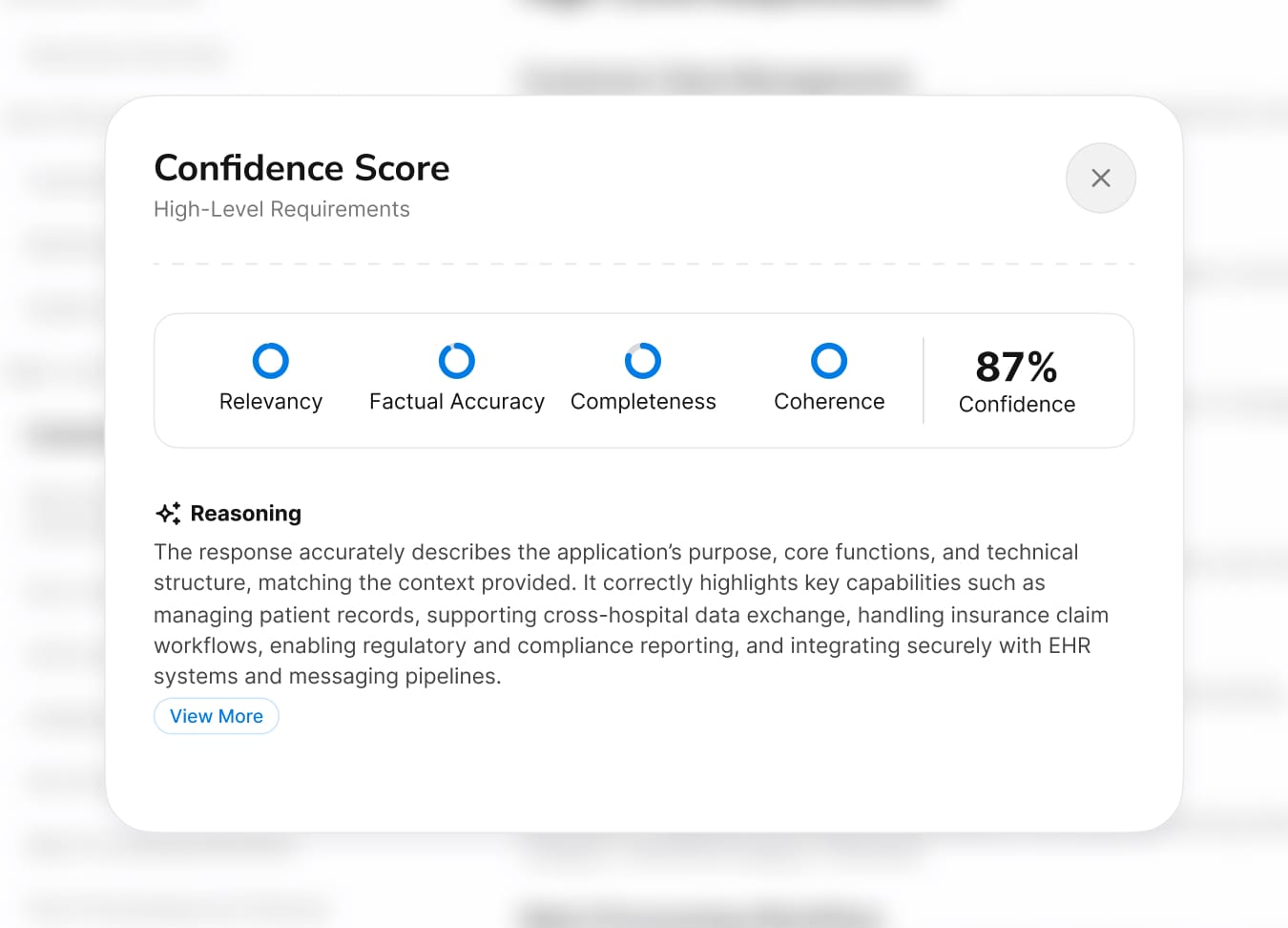
Instead of presenting AI outputs as definitive, we displayed confidence scores on every artifact. The logic was counterintuitive: admitting uncertainty actually builds trust. Users could immediately see where the AI was confident and where it wasn't, so they knew exactly where to focus their review.
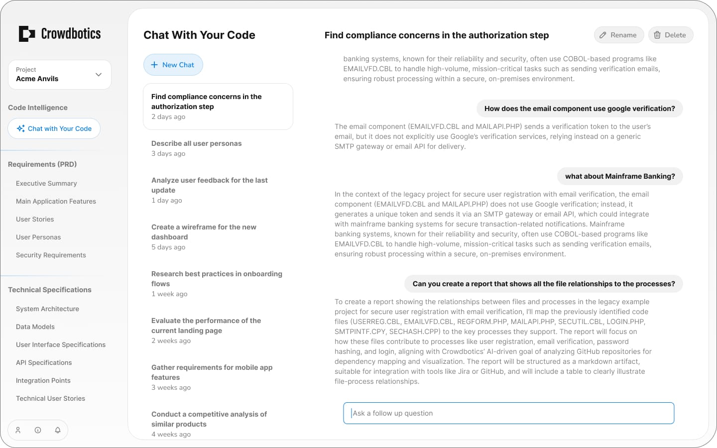
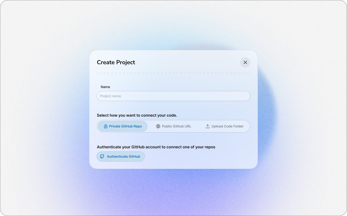
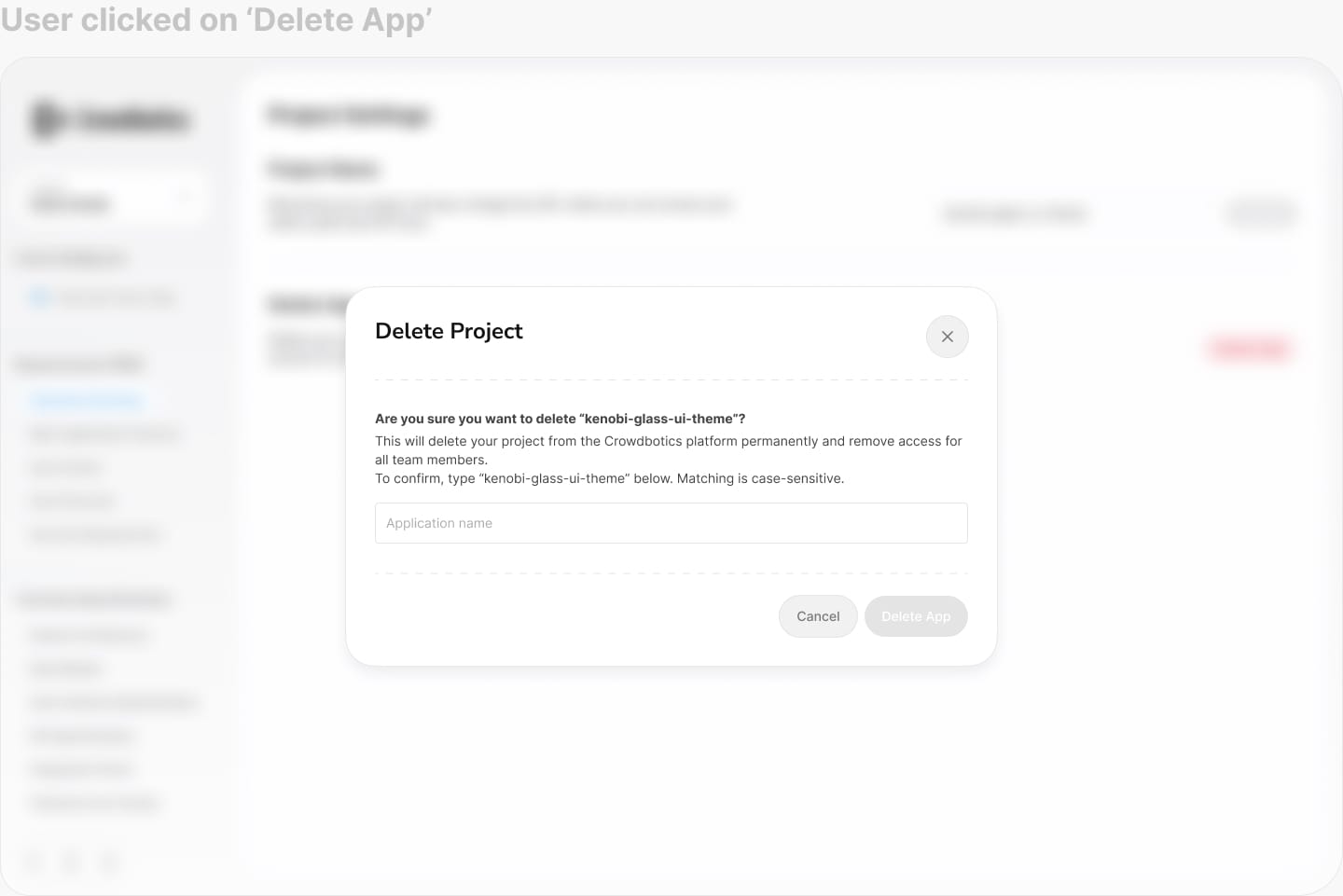
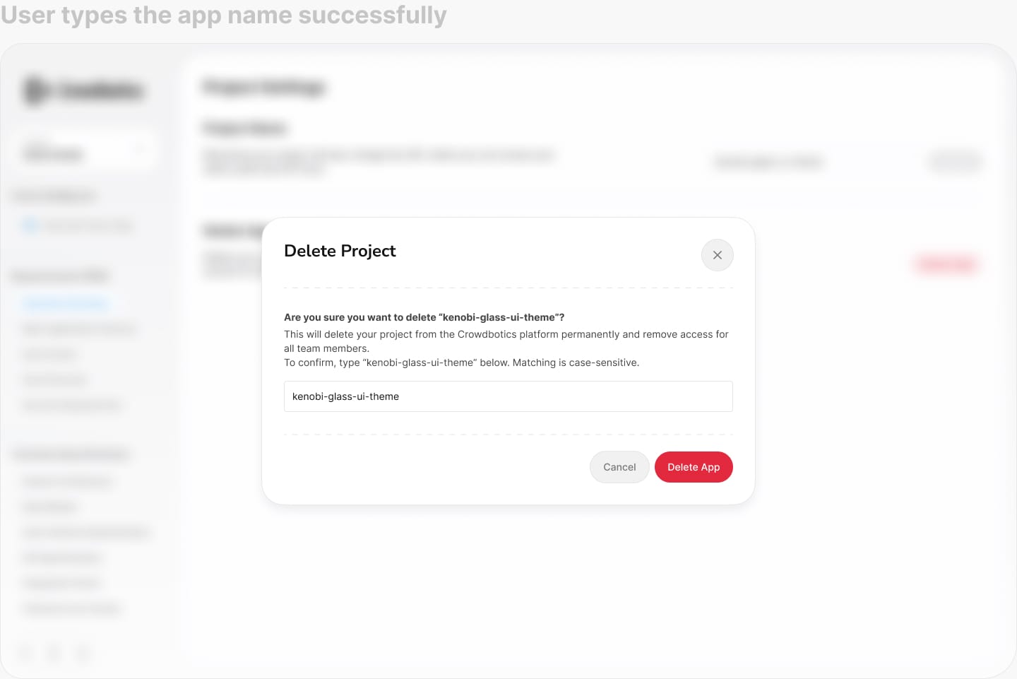
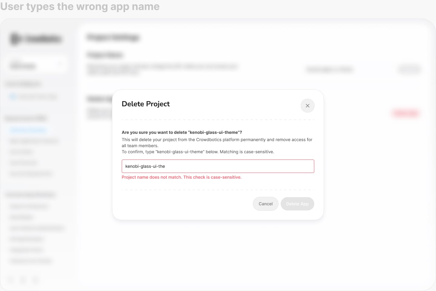
Step 2: Lets Users Change the Prompt (With Guardrails)
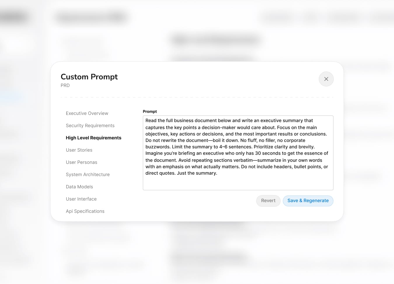
If users didn't trust the output, they needed the power to change it. We let them provide context upfront, adjust the prompt, and edit parts of artifacts directly. Guardrails kept them from breaking the underlying analysis, but the key shift was psychological: users went from receiving AI output to steering it.
Step 3: Show the Source! (Traceability)

Every AI-generated insight links back to the exact source code that informed it. Users can click through and verify any conclusion themselves. The message was simple: don't take our word for it. This was the single most effective trust builder in testing.
Step 4: Full Version Control to Prevent Data Loss
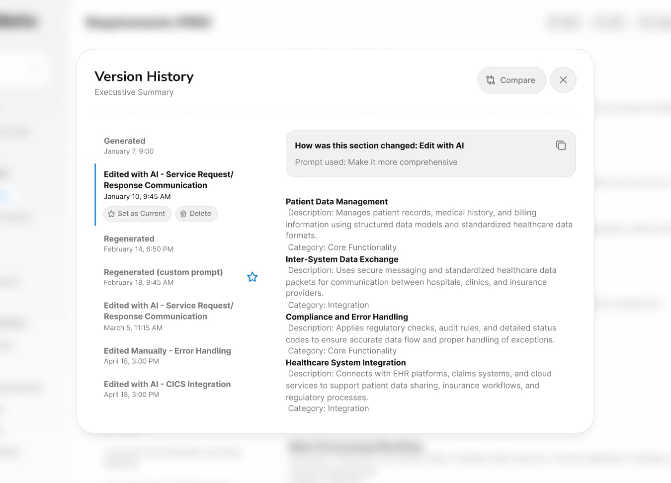
Even if users trusted the AI, they needed to know nothing was permanent. Full version history with rollback, comparison, and visual diffs meant that trying the platform was risk-free. If the AI got something wrong, users could always go back. This removed the biggest barrier to adoption: the fear of irreversible mistakes.
Outcome & Learnings
Customer Impact
70–80%
Reduction in discovery time (weeks → days)
€50–80K
Saved per project by eliminating retiree dependency
3-9 Months
Modernization timeline reduced from 2-3 years
Reflection
As the sole designer working at a rapid pace, I was focused on shipping polished work fast. Everything looked great, and the feedback reflected that. But looking great wasn't the problem. When early testers hesitated to actually use the outputs, it forced me to confront something I hadn't designed for: trust. That moment changed the direction of the project. It taught me that with AI products, what users see matters far less than whether they believe it.
On a personal note, I never expected my curiosity about large language models to become directly useful at work. I had been experimenting with LLMs and prompt engineering on my own time, and when this project needed someone who could collaborate with the AI team on prompt workflows, that personal interest suddenly had professional value. It's a reminder that following what genuinely interests you tends to pay off in ways you can't predict.
On a personal note, I never expected my curiosity about large language models to become directly useful at work. I had been experimenting with LLMs and prompt engineering on my own time, and when this project needed someone who could collaborate with the AI team on prompt workflows, that personal interest suddenly had professional value. It's a reminder that following what genuinely interests you tends to pay off in ways you can't predict.
Bonus Content
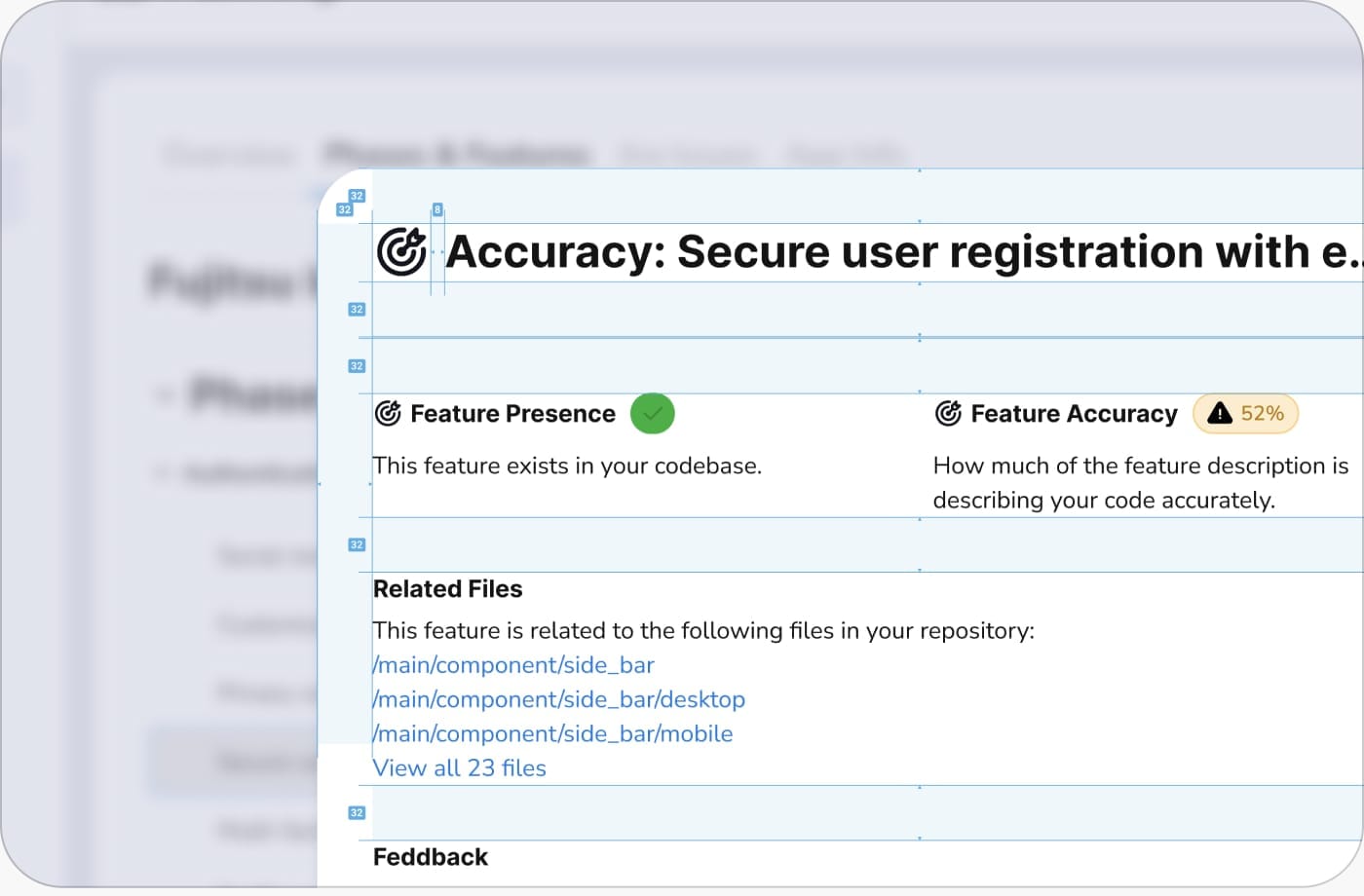
Design Delivery
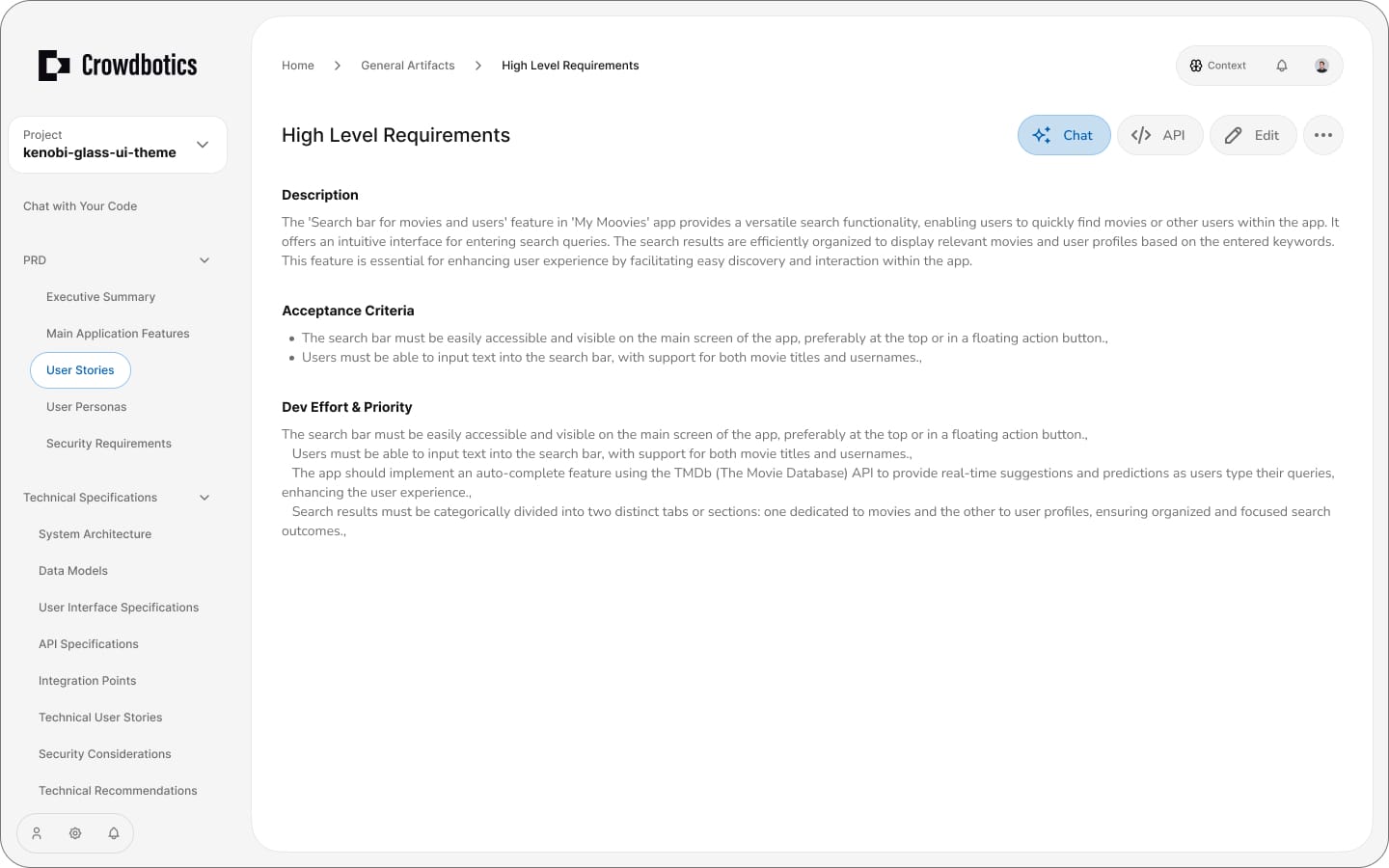
A sample of how I delivered designs to the frontend team. Each handoff included detailed specs, annotations, and context so developers could build with confidence and minimal back-and-forth.
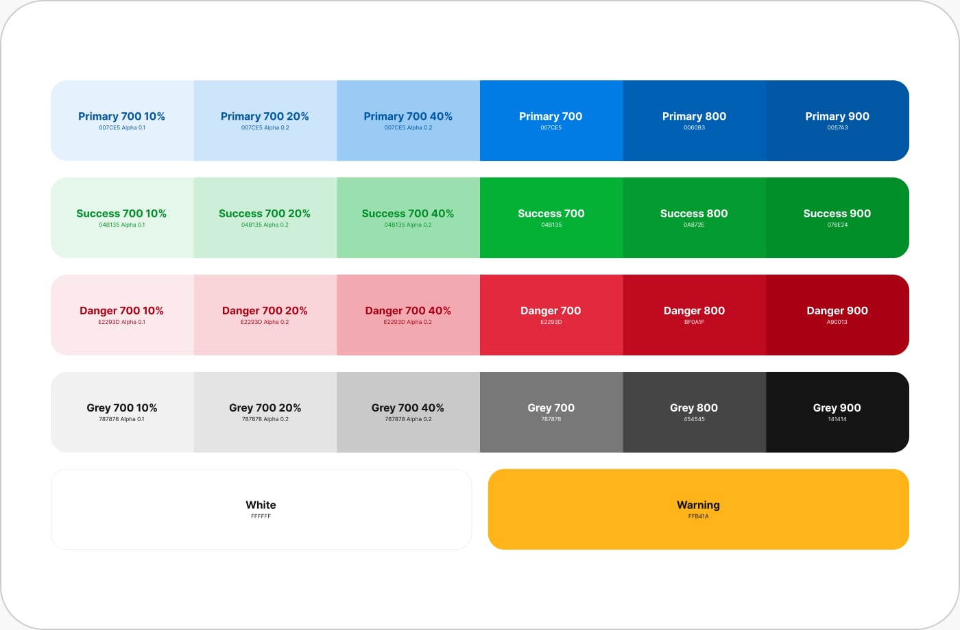
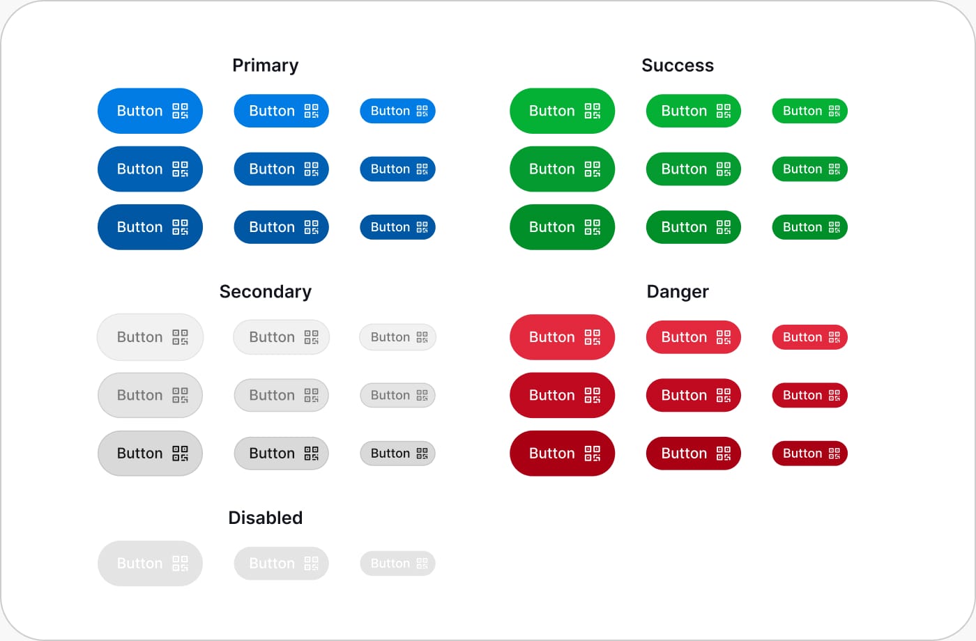
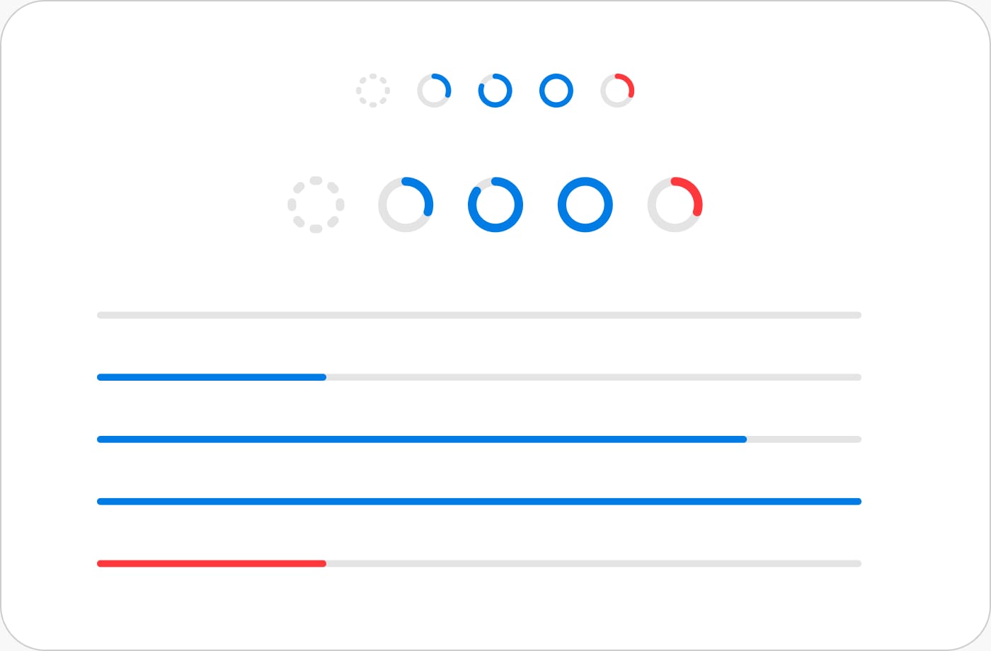
Design System
I built the design system from scratch. I worked closely with the frontend developers to make sure components in Storybook matched Figma exactly, same naming, same variations, so there was never any confusion between what I designed and what they built.
Fonts
Colours
Buttons
Modal Spacing
Progress Bars
More

A limited selection of font sizes ensures consistency and reduces mistakes and odd patterns. Using Inter for UI elements and system fonts for code, with consistent weights and line heights for readability across all contexts.

A video to unify the team
The sudden pivot was difficult for the team. Everyone had to abandon projects they'd invested over a year in. To help lift spirits, I created this video in about four hours to celebrate our new direction. I also had one-on-one conversations with developers who felt their work had been discarded, helping them see how their efforts still mattered and keeping morale high during a challenging transition.
Tools Used